Having a well-functioning website is an important prerequisite for running a successful business. It can be hard to know what makes an engaging web design.
That’s why I’ve put together 25 tricks on how to build your website to make it appealing and engaging for your visitors 🌟
1. Understand your target audience!
It is crucial that you research your target audience and make an effort to get to know them.
Why do audience analysis?
- First of all, you can tailor your messages to suit specific target groups.
- This can lead to lower acquisition costs per customer – also known as customer acquisition cost (CAC) – because you now only attract relevant, ready-to-buy customers.
- Your website design will reflect your target audience. For example, layout, colors, and writing style.
- Target audience and SEO are linked! For example, you can ask them what keywords they might use when searching for a product like yours.
There is no quick shortcut to getting to know your target audience. It’s an ongoing process that involves reaching out and talking to your current customers as well as the potential customers you want to reach. You can read more about conducting audience research here.
2. Match user intent with targeted pages
You can reach your users at different stages of their buying journey. Target the different pages of your website to your user’s different stages.
As a rule of thumb, it is a good idea to communicate only one message per page. The customer will find it easier to navigate and you increase the chance of converting a user into a sale.
Your customers build up expectations even before they land on your website. With every Google search or social media click, your target audience will have set expectations. Your job is to meet those expectations.
Let’s take a few examples:
A customer’s search | Customer expectation |
---|---|
👀 Your customer is looking for your contact details | ✅ A comprehensive contact page |
👀 Your customer wants to understand the benefits of electric bikes | ✅ A detailed blog on your site |
👀 Your customer is looking for a specific electric bike | ✅ A matching page offering a product or service |
Your job now is to build a website that can meet these specific expectations without mixing up the topics. You can do this by following these two tips:
- Do a keyword analysis and create an SEO-friendly website for example with the use of our keyword research tool. With a keyword analysis, you can find exactly the words and phrases that your target audience wants to read more about.
- Create an SEO-friendly website. Once you’ve identified the right words and phrases, creating targeted pages becomes easier as you can separate the different needs from the wants for information.
A cool bonus: Once you have created relevant pages based on the analysis, there is also the possibility that your users will convert much better.
3. Use headlines to make your content skimmable
One of the most important elements to increase your website’s user engagement is to make your content easy to consume for your user. Your user wants to find what they are looking for quickly, otherwise, they will look elsewhere. Therefore your content must be skim-friendly.
Instructions:
- Content should be written in reader-friendly language. Not too many long sentences and foreign words.
- Divide the content into sections of about 300 words.
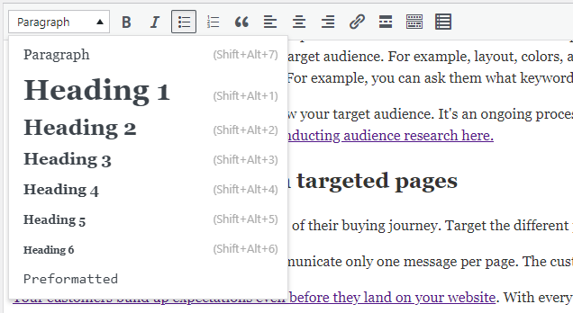
- Use different headings (H-tags) to divide the sections and create an overview.
This also has the advantage of making your content easier for search engines like Google to understand, which increases your chances of ranking higher.
4. Measure if your website’s technique is SEO friendly
Google has a wide range of guidelines for websites. There are many parameters that need to be included when checking if your website is SEO-friendly.
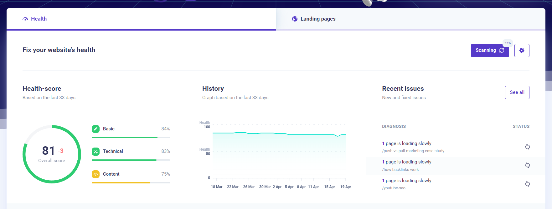
Here you can benefit from using an online tool that can scan your website, and tell you where problems may be and how to fix them like our SEO checker.
Of course, I recommend our own tool, Morningscore (👉get a 14-day free trial), but there are many tools on the market. We’ve made an analysis of the ones we think are the best, which I recommend you read.
5. Make sure the website passes the 5-second test
One of the critical elements of web design and conversion optimization is to make your website digestible. Web designers and marketers use the so-called 5-second test, which simply means that your customers should be able to understand your website in 5 seconds. What do you offer? Where should they click? etc. I’ve seen a lot of websites that don’t pass the 5-second test.
You do the test by collecting quantitative binary yes/no data on whether users actually understand your pages. The higher the amount of “yes” compared to “no”, the more engaging your website is for your target audience. You can also choose to collect qualitative responses, where you can ask the user more in-depth questions. This can give you invaluable data.
The idea here is simple – you show one of your important pages to your target audience for 5 seconds. Then you follow up with 2 questions:
- What is this page about?
- Who is this page targeting?
How can you make these qualitative tests in practice?
We use Userbrain. You simply sign up, describe the task and wait for testers around the world to test your website while recording it. Then you can watch their videos and learn everything you want to know.
6. Add more relevant links in your footer
Another way to effectively improve your website’s engagement and appeal to your users is to offer your valuable pages in your footer. This makes it easier for the user to find their way around your site
For example, suppose you offer a software product. In that case, your footer could contain links leading to specific pages explaining each feature of the product. Similarly, you could have a short list of your services or main product categories. This might be simple, but that’s often what engaging web design is about.
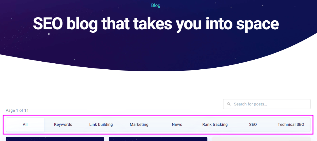
7. Improves your product and blog categorization
One of the best ways to ensure greater engagement and more sales on your website is to organize your website intuitively. Similar to what we explained above about footer links, the way you structure your website directly affects the end user’s experience.
To take it a step further, you also need to think about your search engine optimization. That is, your category pages are likely to rank for important keywords.
But don’t think that this step comes last. In fact, the SEO process already starts at the planning stage. Deciding whether to create a certain category depends a lot on whether there is actually demand it.
How do you check SEO demand? Quite simply by using a keyword analysis tool.
Such a tool will reveal how many people are searching for products like yours. Alternatively, they can reveal how you can use more related keywords that more people are searching for.
8. Make sure the user can find your contact info
Customer engagement is not limited to your website – it can easily be transferred to other aspects of your business. Think of a user who is unsure about what product they want to buy on your website and needs to ask you a few questions. It also increases trust when the customer can see that there is a phone number and an address. Therefore, you should always have clear contact information so existing and potential customers can contact you.
Two places you should add your contact details are, for example, in your footer, and on your contact page.
In addition, your contact details can also be included in other marketing materials, such as PDFs and newsletters. This way, you’ll ensure you capture engaged people the moment they’re ready to interact with you.
9. Direct visitors to your social media
A good way to try to stay in touch with your target audience is to connect with them on social media. If potential customers like your website, they can continue to follow your business on social media. This way, you can stay top-of-mind with your users.
The more opportunities they have to interact with you, the more likely they are to stay engaged with your products and your business. Super engaging! 🙂
Different people prefer different media. Add links to your social media sites on your website and direct people who prefer social media to where they feel at home.
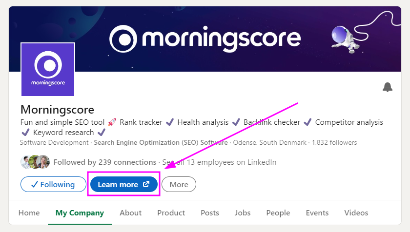
Similarly, you can add a link to your website from your social media accounts. This is a great way to boost your website’s traffic and attract new users. For example, professional media such as LinkedIn offers great opportunities to share content. This way, you will be exposed to a very relevant target audience for your product – people similar to those who are already engaged with you.
10. Boost engagement with relevant internal links
One of the best ways to improve the user experience and make your website more engaging is to link relevant pages together. Linking internal content is a great practice that allows users to understand more about the subject you’re covering.
Additionally, by doing so, you’re improving your website’s relevance in Google’s eyes. This can result in an increase in your positions in the search engine, meaning even more new people can find your content.
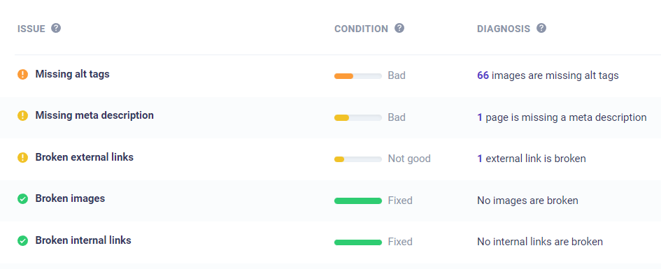
11. Make sure your website has no technical errors
One of the biggest annoyances for your users is when your website doesn’t work. Whether they end up on a dead “404” page, encounter broken buttons and links that lead nowhere, or have assets that don’t display, all of these factors will have a negative impact on the user experience.
This in turn causes you to lose user attention and engagement, which means your website’s marketing performance will drop.
It can be difficult to keep an eye on all elements such as buttons and links. This is where you can benefit from using an SEO tool like Morningscore. It can go in and analyze your website and tell you if some elements are not working. It will also show you how to fix the problem.
It can also be a good idea to regularly take a customer on a journey on your own website, where they try to navigate around the site and buy a product. You’ll quickly notice if elements don’t work, the layout of the website is broken or a spelling mistake has crept in somewhere.
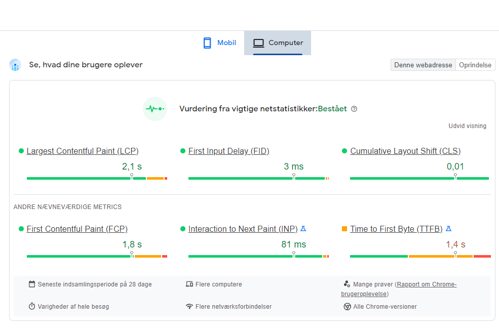
12. Increase the loading speed of your pages
Nowadays, users expect everything to be at their fingertips instantly. Therefore, a slow website can harm the user experience and cause the user to leave the page before it loads. Just 1 single-second increase in loading time reduces the number of visitors by 11%.
Even if your website has an amazing and engaging design, it may simply take too long to load – causing users to run out of patience.
You can test the speed of your website in several ways. The most popular option is Google’s PageSpeed Insights which is free and quick.
If you find that your website is too slow, you should work on increasing the speed. One of the low-hanging fruit here is to reduce the size of graphics and images. There are also more technical measures you can take. You can read about them in this article.
13. Use attractive page titles to get more clicks
A page title describes what a user can expect from a page before they click on the link. It is an appetizer for your website. Your page title is shown when you appear in Google searches or pages from your website are shared on e.g. social media.
Page titles are important – not only when you share something online – but also when others share your website. If your page title is nondescript or irrelevant, you’re missing a great opportunity to attract users to your website, so it’s important to prioritize a good page title.
14. Build trust with a detailed ‘About’ page
Your about page is essential to build trust with your website visitors.
An about page helps you create a brand that people positively associate with. Your business seems more “real” when it has an about page. This leads to more clicks on your website, as well as likes and comments on your social media.
As an indirect factor, building trust in your name can also help you rank higher on Google. In recent years, Google has prioritized E-A-T, which has had an impact on rankings. The acronym stands for expertise, authority, and trust. Therefore, a well-optimized ‘about us’ page is beneficial for many aspects of your business.
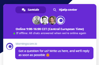
15. Install a chat system on your website
One of the best ways to show that you are trying to engage your visitor is to install a chat system on your website. It can be a professional solution that allows you to automate your support for more complex products. In fact, chat systems have been proven to increase conversion rates and engagement.
There are many different systems, but it can also be a completely free system like Facebook’s Messenger chat.
A good way to use your chat system is to be proactive with it. Instead of just waiting for users to write to you, you can create triggers to interact with them.
We recommend Crisp (we use it ourselves) for a full chat solution or Powrs chat tool for a simple and affordable start.
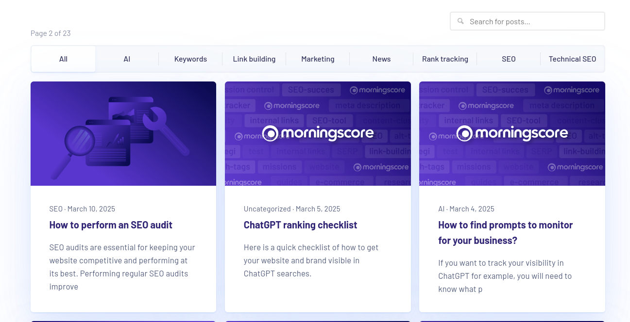
16. Engage visitors with relevant blog content
Creating more content is probably the best thing you can do to improve your website’s engagement. You don’t have to start with a huge blog, you can start small and build it up bit by bit.
You can write about common problems or questions that your target audience wants an answer to. This builds more trust with potential customers and establishes you as an expert in your industry. They can also create demand from people because you can present products that solve latent problems.
Investing a little time each week to create content can also allow you to build a library of content. From there, you can use these articles to complement your products and services to existing customers.
With more (and better) content, you will not only satisfy returning visitors – but also improve your search engine optimization. It will also bring you more organic traffic from search engines like Google.
Finally, you can turn the content into a PDF and offer it as a download in exchange for an email. Content reuse is a practice known as Content Syndication, and it’s a great tactic as it accomplishes two things:
- By downloading your content, users can review it later. This means they can have multiple touchpoints with your brand – even without you having to invest a single penny in advertising.
- You can ask users for their email in exchange for the PDF, in the same way as a lead magnet. This way, you will also grow your email list, which provides even more opportunities to engage your users later on. and convert them into paying customers.
17. Add testimonials or reviews
You can also improve your website by incorporating testimonials and reviews. Using social proof is an effective way to show others already trust you.
Social proof can be almost anything: from logos of companies you have worked with to verified customers of your products, short video testimonials, and long review pages. The important thing is not how you show your social proof, but that you do it in a clear way.
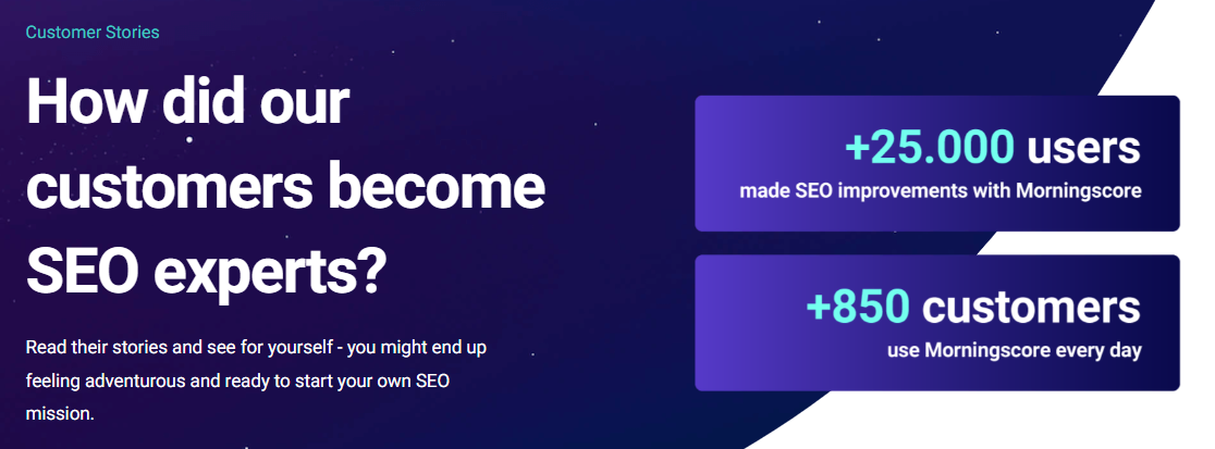
At Mos Morningscore we have chosen to show our social proof in several ways. We have a logo wall, reviews in our footer, and a page with a lot of customer cases.
18. Engage users with visual elements
One of the easiest and cheapest ways to make your website more appealing to the user is to add visual elements. You can use different images for different purposes, for example:
- Help highlight the most important elements of your website.
- Help navigate users’ eyes to where you want them to go.
- Help reinforce your branding by building a visual that fits your brand.
There are many places where you can find free inspiration and tools to help you with the visuals on your website. Firstly, there are free stock images from which you can download free graphics. There are free online editing tools like Canva that save you from the expensive Photoshop license. Finally, there are inspirational websites like Pinterest where you can find ideas for your images.
With tools like these, the possibilities are endless – and more importantly, adding powerful effects to your website has never been easier.
However, you don’t have to limit yourself to images and graphics. For example, tables and videos are another way to increase your website’s appeal.
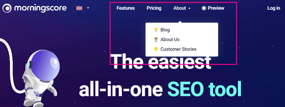
19. Create a perfect navigation menu
Your navigation menu should be spot-on. That is, you should have all the pages that are important to your business in your menu.
There’s no formula for how many links you should have in your menu, but aim to have your most important pages first. Anything you consider a priority can go in a drop-down menu – and the rest can just be in the footer.
Let’s go through some examples to show which pages you should consider displaying. Keep in mind that nested menu items can really go a long way here, as it saves valuable space horizontally – yet utilizes the more freely available vertical space (i.e. scrolling in a drop-down menu).
To learn more about how to structure your menu based on the type of website you want to make, read this guide.
2o. Create good Call-To-Action buttons
One of the biggest reasons why users don’t convert is poor call-to-action buttons. Many websites use reluctant language when trying to get the user to complete an action. Others are too explicit and try to get to the end goal immediately – without building the much-needed relationship with the user.
The best quick advice here is to focus on the positive outcome. Answer what pain your product solves and how you can turn it into a button. Combined with a good headline, this can make your website more engaging in the eyes of potential customers.
For example, suppose you offer a product that notifies users when their website is down.
First, choose the “real” problem your target audience has. In this case, it could be “My customers don’t want to look unprofessional or lose their customers – so they want to monitor their uptime”.
Next, define the unique way in which your products solve their problems – i.e. what makes you stand out from the competition. Something like “We check your website every 30 seconds and send your team a notification when a problem is detected”.
Finally, answer which button would make the most sense in this case. Adding “sign up” might be too restrained based on your 2 previous sentences. Instead, give them the previous example, so it’s something like “test your website’s performance”. It sounds more concrete, relevant, and action-oriented.
21. Simplify your pages with more whitespace
Another element we often ignore when building a website is spacing. We often forget to leave plenty of space on the page between all our text and graphics. One of the best ways to make your website easier to understand for your target audience – and this applies to all industries – is to use a lot of whitespace.
This means having enough space both between different elements and within individual components. For example, line height and letter spacing in your paragraphs will make your content easier or harder to understand depending on how compact it is.
Therefore, make sure you have plenty of space on the page to make your content easier to read.
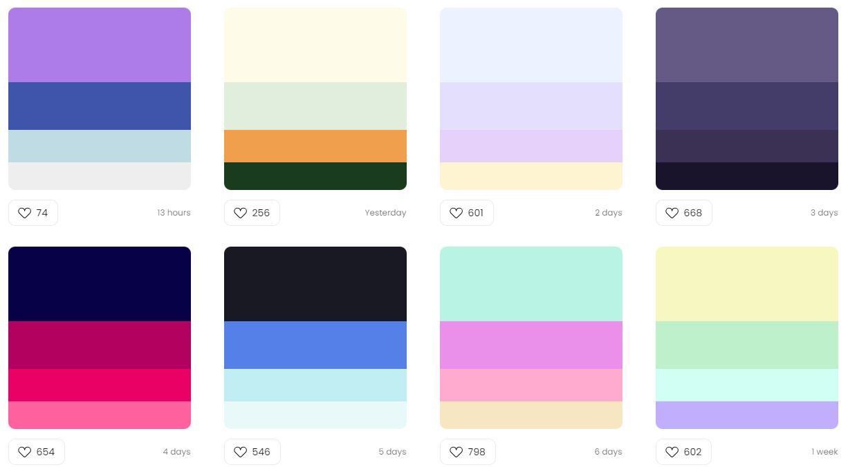
22. Use colors that complement your brand
Your colors help communicate your message and brand.
From color psychology, we know that different colors affect users in different ways. For example, yellow is associated with “cheap” or deals (Netto). Blue is trustworthy and there are many banks and large companies that have blue in their logo.
You can do two things to make it easier to associate your brand with the color that best suits your type of website.
First, narrow down the message you want to communicate as a business to your target audience. Secondly, customer surveys directly reveal which colors your customers prefer.
It can also be indirect customer research – for example, exploring the best-competing websites and blogs in your industry. This reveals patterns that will guide you in choosing the right color palette.
For example, your call-to-action buttons should stand out from the background color. This way, you ensure that your users can distinguish between them and understand what you want them to do on the page.
Using appropriate colors on your website is an art in itself. That’s because you need to understand which elements should blend into the design and which should stand out from it.
23. Use web-safe fonts that are easy to read
The fonts you use on your website have a direct impact on readability. Using standard fonts that visitors are used to seeing is usually a safe choice. Otherwise, if you want to go the creative route, it’s usually best to consult a design and UX expert who can find the right font for you. Standard fonts are also known as “web-safe fonts“. They are pre-installed on most devices that have access to the internet.
The more non-standard fonts you load, the longer it takes for the user to fully load a page on your website. In turn, the slower loading time can have a negative impact on the user experience and thus make your website less attractive to visitors. As we have mentioned before, it can even cost you valuable rankings on Google searches.
24. Optimize your website for mobile devices
We’ve all been on a website that is not optimized for mobile. There are pop-ups you can’t close, and you have to swipe back and forth on the screen to see the image or read the text.
Since many potential users are on mobile devices, it is important that you remember to optimize your mobile device for a website.
Mobile devices have smaller screens, poorer internet connections, and are slower than desktop computers. Therefore, an automatic popup can take over the entire screen and ruin the user experience.
25. Create a search function on your website
If your website (or blog) doesn’t have a search box, you’re missing out on useful data. One of the best ways to understand your customers is to look at how they use your website.
The site search feature gives you just that, as you can easily see what customers are searching for most – and from which pages they are searching. This allows you to make highly relevant changes to your website that satisfy your visitors. This can result in increased conversion rates – and ultimately your bottom line.
As a side benefit, you also gain an understanding of your users’ needs. With a simple report on how your website’s search bar is used, you can quickly develop ideas for new content or new products.
Making your site attractive – In conclusion
These were 25 practical tips on how to improve your website and the engagement of your users. There were both content and design tricks. As a final note, it is always a good idea to test the changes on a selected group of relevant end users.