Landing pages are great. They are the perfect symbiosis between great User Experience and effective SEO.
A page that ranks high on Google AND brings customers? Yes, please! Sign me up!
Indeed a no-brainer when it comes to growth marketing.
We plan out the perfect structure. We express our creativity through the masterfully crafted layout. We diligently craft content which will bring customers. Or so we think.
As it turns out, sometimes our Landing Pages aren’t ranking as high as we want them to. It’s not as simple as writing blog posts. After all, there could be a million reasons! And that’s bad – because it directly impacts our bottom line. But worry not.
In this article, I’ve collected 6 concrete and in-depth on page SEO tips on how to optimize your landing page layout for SEO. Also, they come with real-life examples of Landing Pages I admire – in order to get your creative juices flowing. Without further ado, let’s dive into each SEO tip.
And here they are:
- Keep The Landing Page Layout VERY simple
- “Hide” Content Not Needed Initially
- Spend Extra Time Optimizing Headlines
- Ensure Lightning-Fast Page Speed
- Incentivize Further Click-Throughs
- Ensure Mobile-Friendliness For SEO
Let me break all of these points down with concrete advice.
Tip #1: Keep The Landing Page Layout VERY Simple
The very first priority for your landing page is to provide a great user experience – and therefore convert visitors into leads and users. From BJ Fogg’s Behavior Model, we know that Landing Pages should have a high “Motivation” and low “Friction” points.
In practical terms, this translates to:
- being able to guide the users’ eye seamlessly
- removing unnecessary friction
Let’s break down how you can achieve them both:
The simple way to guide users effectively and remove friction is to use colors effectively (e.g. in buttons), keep good margins between elements (whitespace), and use images creatively.
- Using Colors Effectively
Because humans are visual animals, we can naturally and easily spot high-contrast differences – our attention is drawn to them. Your goal here is to make your important elements such as Headings and Buttons in a contrasting color that stands out from your page’s background.
This is important because it makes things easily digestible for your visitors. When you provide that, you will decrease the friction – and your average visitors can turn into customers. And these engagement signals (i.e. higher time on page, clicks on the page, lower bounce rate, etc), in turn, are ranking factors which Google uses in their algorithm.
Additionally, think about “The Fold”. Using colors between sections – especially in The Fold – can push users to scroll down and explore what’s next.
Here’s a cool example from Filter Off:
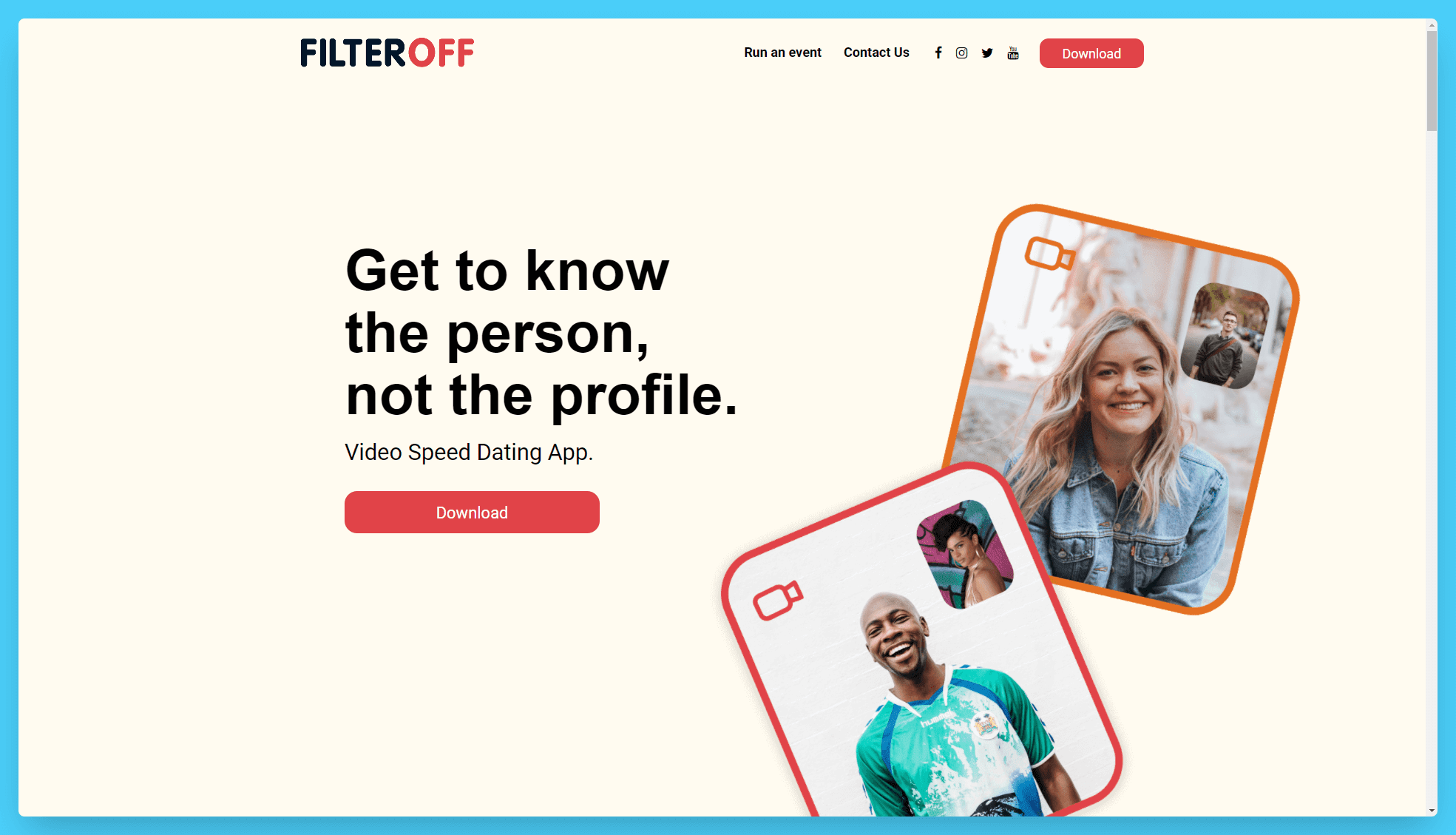
We can definitely say their landing page is made with the end-user in mind. Their CTA buttons are simple and congruent, and most importantly stand out from the background.
Also, you can see a different color section already in The Fold – which incentivizes you to see what’s actually there.
- Keeping Good Margins
This is a rather simple one. Very crammed websites increase Friction in the user because they cause confusion in them. A rule of thumb I personally use here is that every element has to earn its place on the landing page.
That’s because every element is fighting to get the users’ attention and I don’t want to distract them from the ultimate goal – stay on my site and convert.
If you’re presented with 5 elements, potentially all of which have their own CTA Buttons, your brain has to use more processing power to decide which element does what – and will take you to where you want to go. And we humans simply don’t like that 🙃.
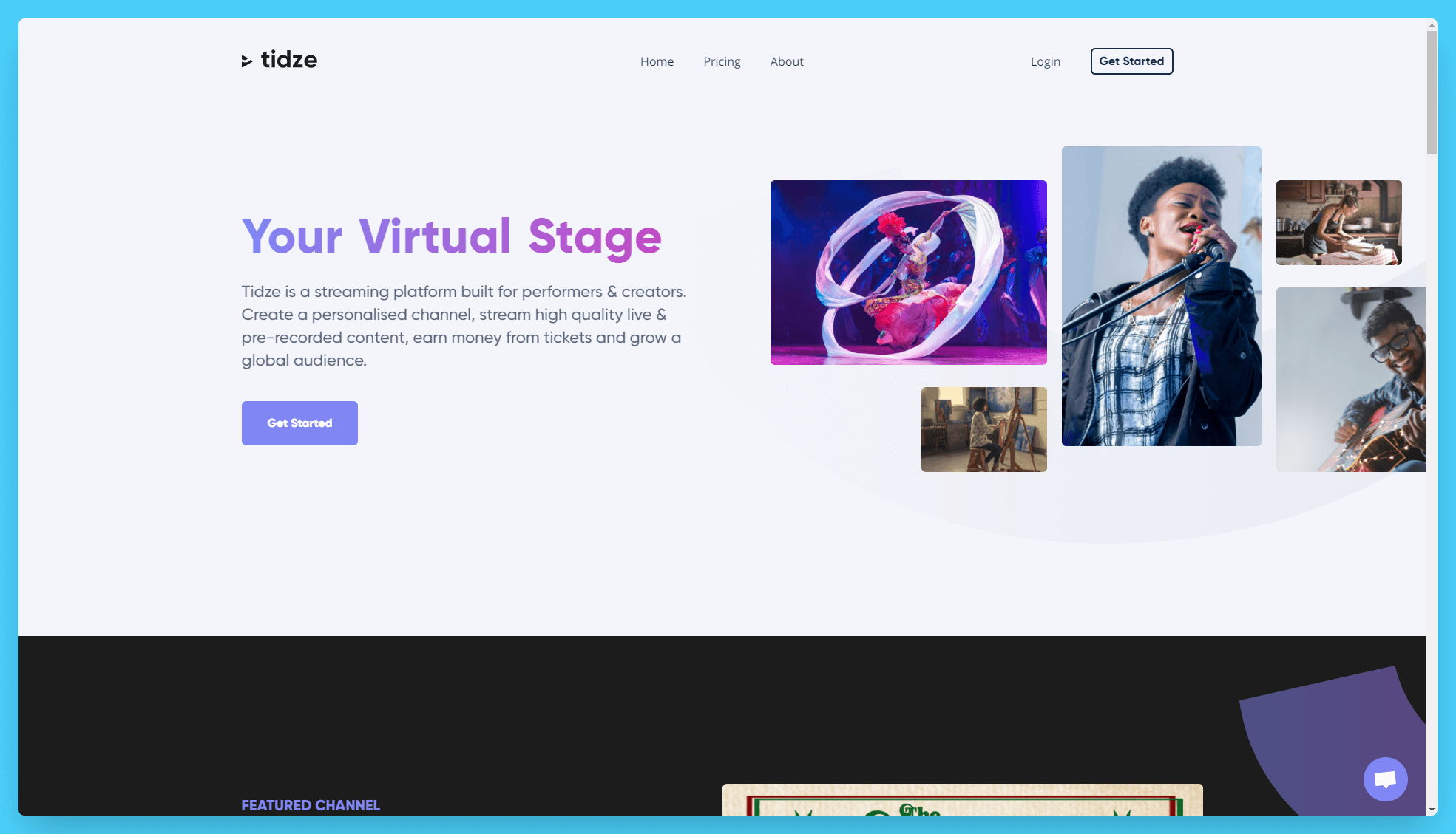
My best tip here would be to allow yourself to have “bad” margins in The Fold so that users can see the very next section of the page. After that, stick to a certain style guide and maintain good margins.
Here’s a great example from Tidze:
- Using Images Creatively
Similarly to the two points above, you can use images to guide the user to the next section. If one of your high-quality illustrations is cut off right under your Hero Section, users are more likely to scroll down to see it – because it will grab their attention. This way, they will continue exploring the page. And that’s good for both parties involved.
Here’s a great example from Doo:
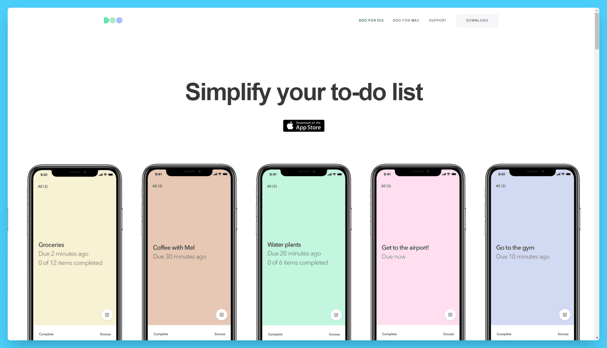
As you can see, their images “cut off” in the Hero Section. And the denial of information, the suspense incentivizes users to scroll further down.
Tip #2: “Hide” Content Not Needed Initially
Because landing pages have to provide a good experience, this means you should keep your texts simple, too. This also plays well with the idea that users likely expect NOT to see big blocks of content on a product landing page.
But since you need your landing page to rank high, how can you bridge the gap between having enough SEO content and not ruining the user experience?
Your best friend here is “expandable JavaScript”. That is, with some styling, you can hide the content that is not initially needed.
Now, I know, I know. Google actually gives less priority to content that is not initially visible. For those of you who didn’t know, that is to say that content that is not initially visible and requires a user interaction to appear gets less weight and ranking power by the Google Algorithm.
Because of that, you need to ensure the content that is, in fact, initially visible contains your very main and most important keywords. You can “hide” additional long-tail keywords and content in the expandable sections after that in order to reach a good word count.
To name a few places where you can use that, for example, this can be in:
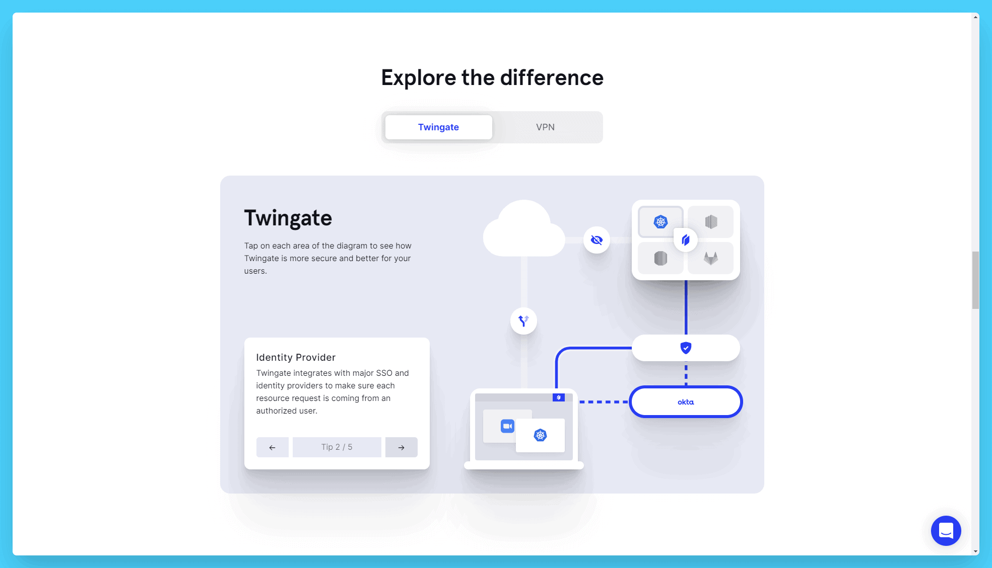
- Sections where you present different features and sub-features of your tool
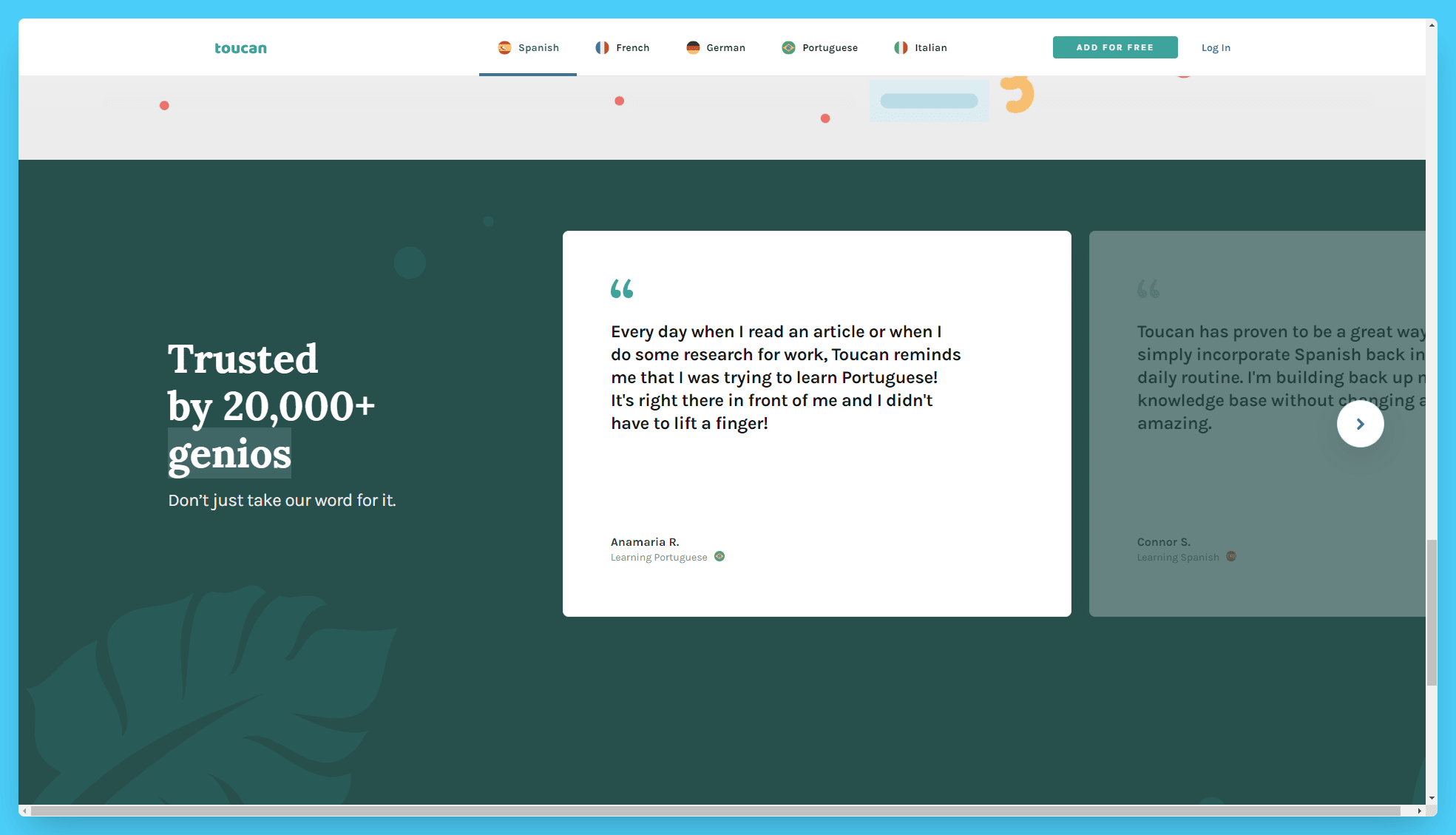
- Customer review sliders and widgets
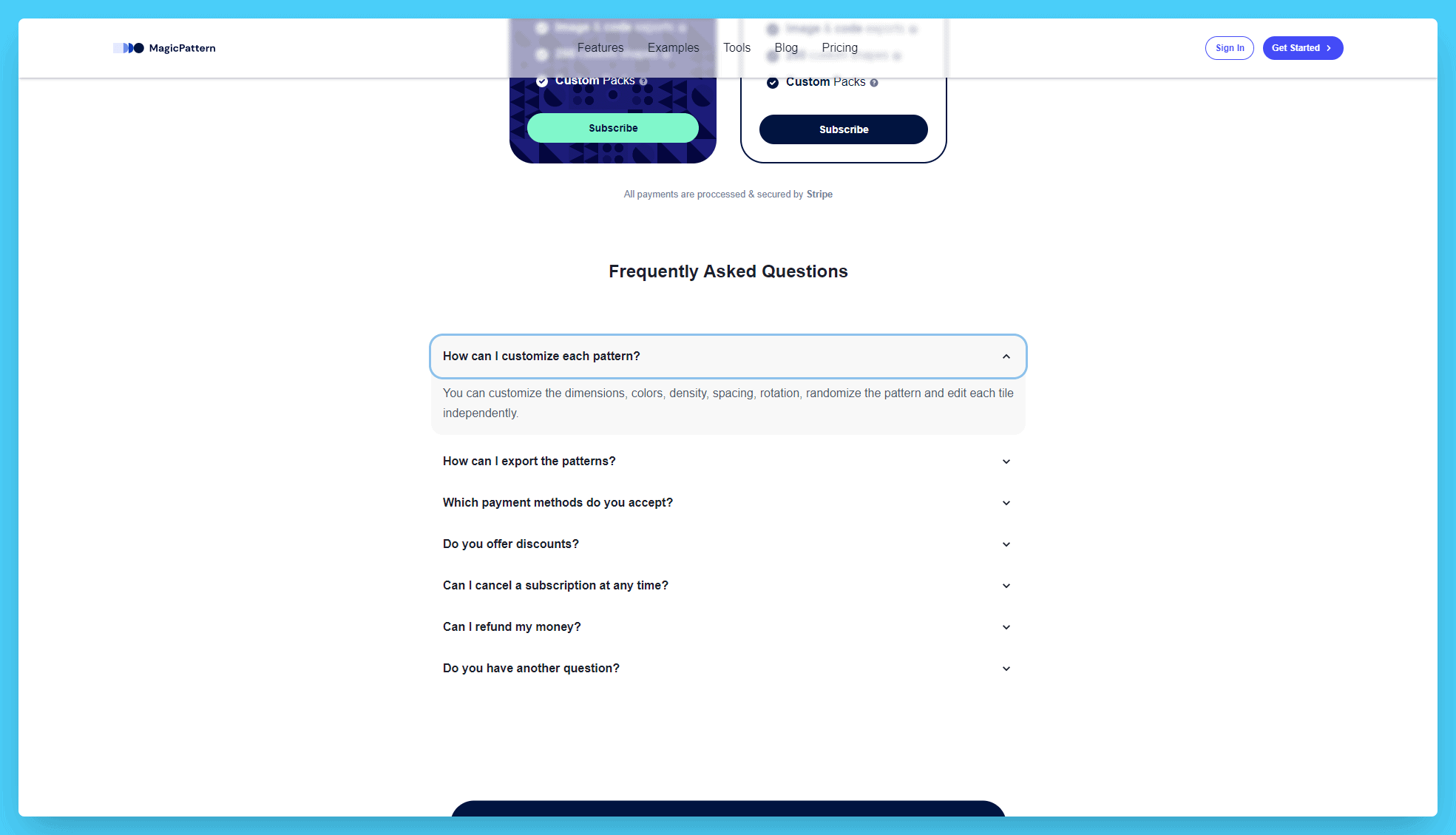
- Frequently Asked Questions (FAQ) blocks
Here’s a few good examples:
Twingate’s Features Explainer Section
Toucan’s Customer Review Sliders
MagicPattern’s FAQ Block
This mini-project is great and I absolutely love using this trick to add more content to my pages. But before you dive in with it, there’s something important to note about it which you can find in Tip #6 below.
Tip #3: Spend Extra Time Optimizing Headlines
Your headlines are some of the most important elements when it comes to both SEO and conversions. Because of that, you need to effectively make them serve both purposes.
For your Landing Page SEO layout, this means that you need to include your target keyword in the headline. You can do that in a way that plays with your unique USPs as well. One strategy I find effective is to use a question. Questions provoke us and, as naturally curious creates, we humans have the need “to answer it”.
For example, imagine you offer a new gamified CRM system that has an incentivization system built in. A great way to use your keywords in your H1 (headline) & first copy would be to ask and answer a question. Here’s a wild example I just came up with:
“Who Said Your Content Management System Can’t Be Fun?
Meet ConnectLoop. The gamified CRM System designed to help you sell more. With the built-in reward system, your sales process is as easy as pie. What a better way to get your Sales Manager to love you?“
This question would both feature your keyword – and would be intriguing enough for users to explore. And notice how it once again ends with an open question?
Scrolling (and exploring the page) used to be a problem in the early days of the web because users didn’t know they could do that.
Nowadays, the scrolling problem is slightly different – users don’t scroll because they aren’t engaged. If you don’t immediately capture their attention and spark some interest, that’s it. They bounce back to Google, and your page slowly de-ranks because of the negative User Signals.
So the goal behind asking such questions is to get the user to scroll down and explore. The longer they stay on the page, the more they consume your brand – and this increases your chances of convincing them to convert to the next step.
We humans love tying up loose ends. It’s just the way we are.
Last but not least, as a general tip, be very aware when taking inspiration from other websites – especially bigger companies. Companies like Asana and Microsoft “can afford” to not include their keywords and have a vague-sounding and inspiring message simply because they are very well known brands which people recognize. Your brand likely isn’t yet – and being vague will only cause friction and confusion.
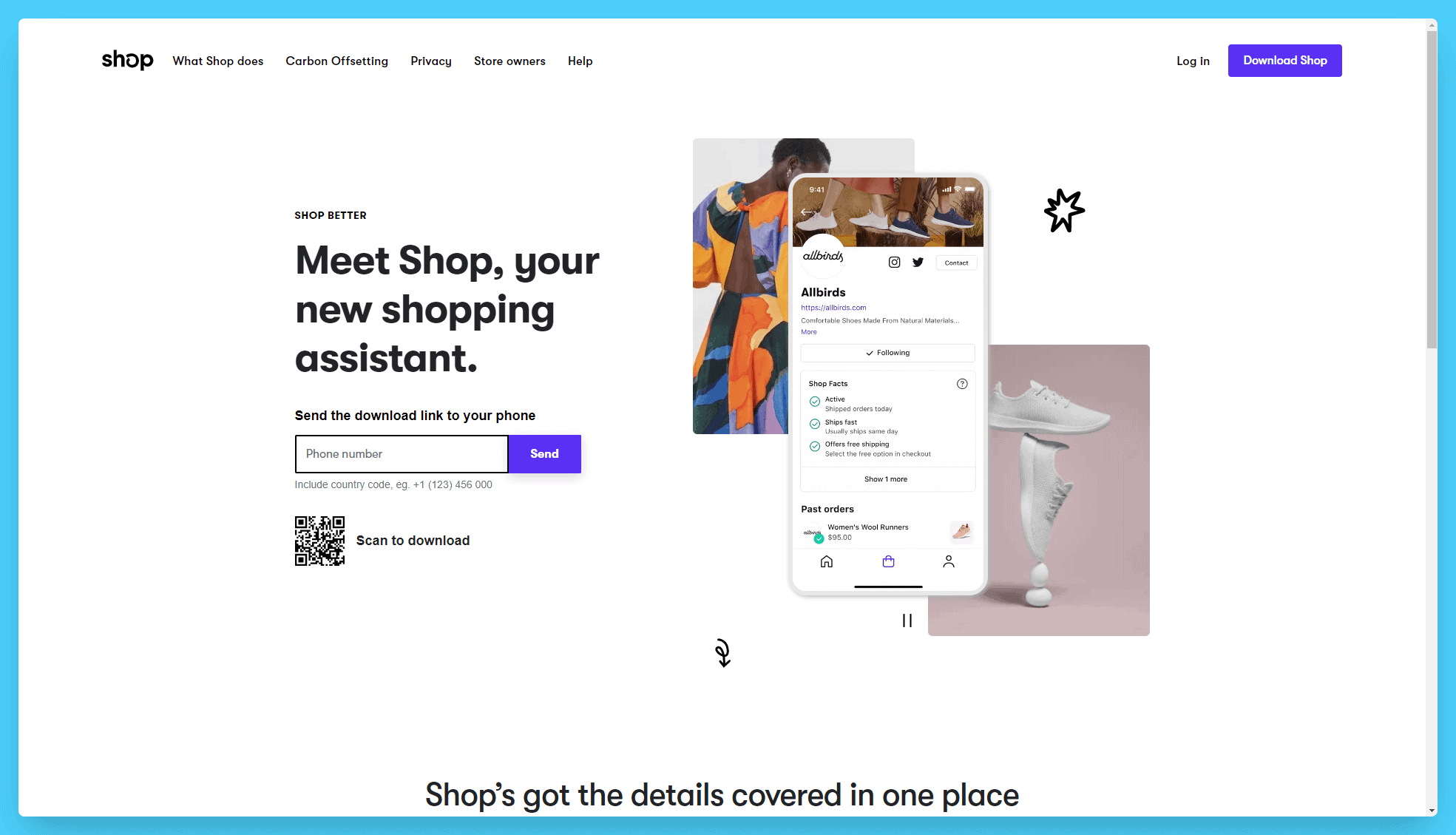
Shop is a great example of Landing Page copywriting that also fits SEO:
Tip #4: Incentivize Further Click-Throughs
Now, I absolutely love this step because it’s a direct indicator my landing pages are working. The concept here is this: use smart copywriting techniques and secondary CTAs to incentivize users to click to other pages on your website – EVEN IF they aren’t ready to convert now.
Basically, this one is a no-brainer because:
- Google Users User Signals In Their Algorithm
- No One Buys After A Single Interaction – People Need To Get To Know You
Let’s address both of them.
Firstly, how users interact (or don’t!) with your websites is a direct ranking signal for Google. If users coming through Search Engines come on your site and like what they see, they will behave a certain way. They will spend a good amount of time on the page, potentially click around and go to another page of your site.
The same is true in the opposite case. If users don’t like what they see, they will return to Google shortly after landing on your page – and potentially click on yet another search result.
Secondly, your potential customers’ buying behavior has changed. In the early 20 Century, people would buy things off of a TV ad – simply because there was nothing like it on the market yet. Novelty was a big part of such sky-high product sales.
Nowadays, consumers are able to find everything about a product in a few searchers. Your job here is to save them those searches. To turn SEO visitors into customers, you need to engulf them with your brand – in the most natural and congruent way possible.
Using good copywriting techniques like open-ended questions, USPs and emotional motivators can ensure that your page ranks because users interact with your website. For example, users searching for “fast website chat system” would likely love to read your “0.2 Seconds Load Speed: How We Made The Fastest Chat System” article linked at the bottom of your Landing Page.
Togeto’s Landing Page is a great example of it:
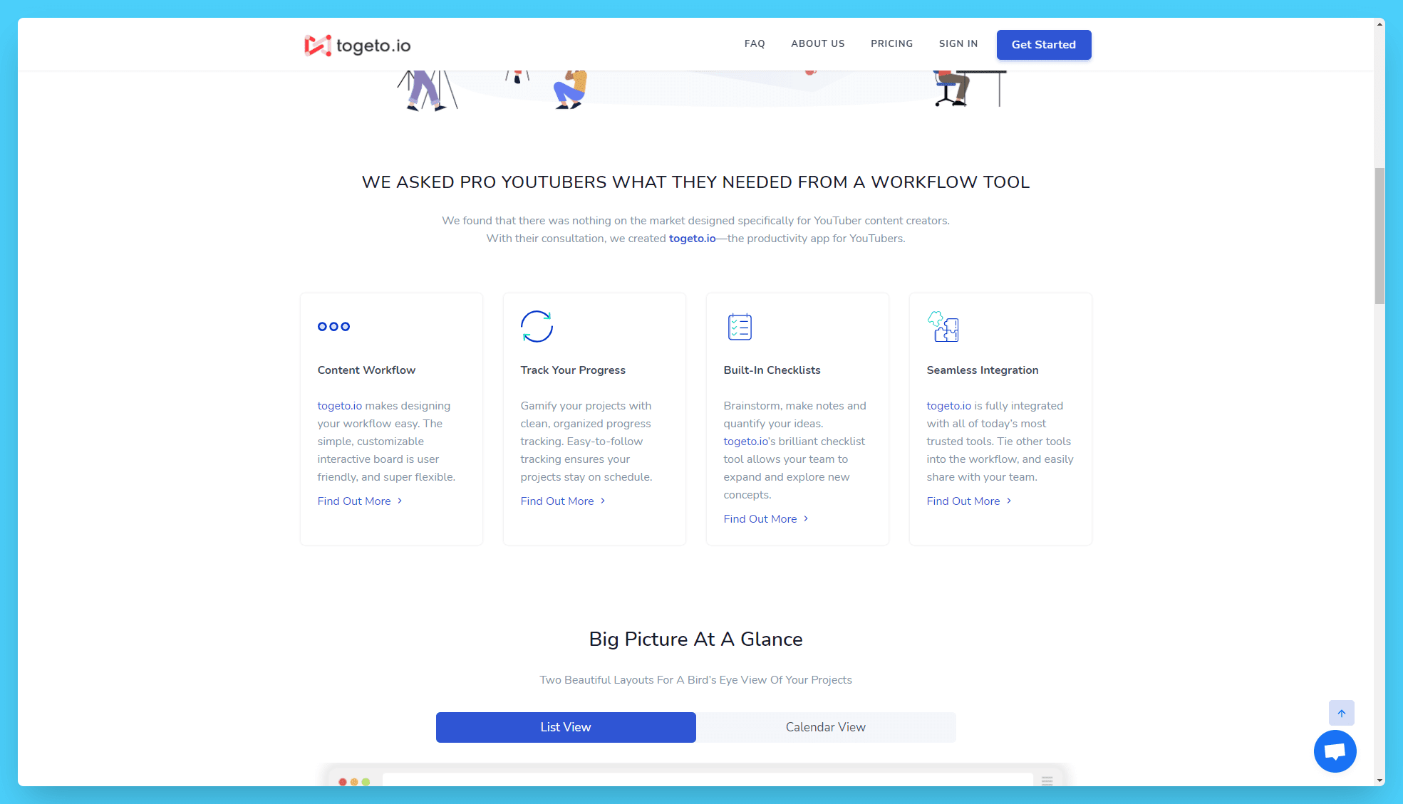
These guys’ strategy is brilliant. You can see how they use links to each individual feature that is relevant to the landing page as secondary CTAs to keep the users on your site.
Tip #5: Ensure Lightning-Fast Page Speed
One of the big mistakes I see with Landing Page SEO is not paying attention to your site speed. Yeah, I know you know, and because of that I’m not going to give you out-of-the-box advice here. What I’m trying to say is that we often tailor our landing pages with additional supporting elements – and these elements can introduce new images, scripts, and styling that can drastically slow down your page.
In fact, I recently had to deal with such a problem. On some of our important landing pages, we had introduced a widget / modal where users could directly book onboarding meetings with us.
Everything was great until I ran a PageSpeed Insights scan on it. Believe me or not, “a simple” Hubspot Calendar embed added close to 2 SECONDS of load time to our page. As an SEO guy myself, you know how that went. Sometimes to rank higher you need to make sacrifices.
So my best advice here is to scan your important pages and note down the heaviest elements that slow down your load speed. Lazyload images and videos, remove unnecessary scripts (e.g. random analytics tools) and monitor the number of requests the page makes.
Ultimately, in your code you’ll only be loading the styling needed for that specific page – but I know that’s not realistic for everyone so focus on the assets that are easier to control without being a developer.
And here’s a great tip for last. There are tons of page speed tools out there – but “the one true God” when it comes to it is PageSpeed Insights. You are getting traffic from Google, and thus that should be the only benchmark you use for your website’s speed performance.
The downside with PageSpeed Insights, however, is that it doesn’t give you as detailed explanations as some other tools.
Because of that, I’d advise you to use either “PingDom Tools” or “GTmetrix” – which are page speed tools that I’ve tested and recommend.
Tip #6: Ensure Mobile-Friendliness For SEO
Now, wide screens make it easier for designers to express themselves. Because of that, they often design websites on desktop first, and then adapt it to the mobile version. Your website designer likely did the same.
But this can be potentially bad for your Landing Page SEO. If your desktop layout features elements that are supposed to help SEO – but your mobile page doesn’t (e.g. because the developers couldn’t fit them in), this can give you a false idea that your SEO is fully done.
Remember, when Googlebot crawls your website, it actually scans the mobile version of it. As I prompted you above, this can be problematic especially with some badly planned expandable JavaScript elements.
If your developers are looking for a shortcut and simply remove some of the sections on mobile, this means that you’re not getting any SEO value from them. Because of this, Google can see the content on your Landing Page as “thin” and therefore decide you don’t deserve to rank at the top of the search results.
Additionally, if you check your Google Analytics, you’ll likely notice that disproportionately more users come from Mobile compared to Desktop. Because of that, completely hiding content on Mobile can be a bad idea. How to solve this?
I’d personally advise using vertical “sliders” and “transitions”. For example, in most cases, the example sections we mentioned in Tip #2 can be styled into elements with a horizontal scroll (be it through left & right arrows or finger dragging). This way, you’ll preserve the content which users can explore – and have the opportunity of ranking higher.
To make the argument even stronger, remember that all of the tips above apply to mobile devices ten times as much.
Visitors on mobile phones usually browse using mobile data service, where the internet can be slower than WiFi. Combined with the lower computing power phones have vs desktops, this can result in bad UX with long page load times.
Last but not least, the smaller screen on mobile devices means you absolutely need to narrow in on your most important CTAs – and make them stand out through contrasting colors.
And here’s a great example of a landing page layout from Miro that just works on mobile:
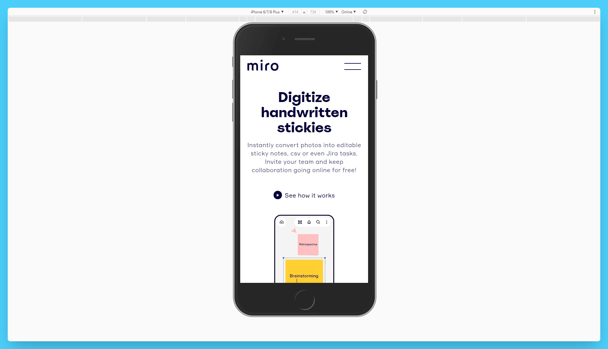
It flows beautifully, delivers the message effectively – and I’m pretty sure it converts like crazy.
Wrapping It Up
That’s it for now! Those were my 6 tips on how you can optimize your landing page layout for SEO. I sincerely hope they help you rank higher, engage customers more effectively, and ultimately grow your business.
Since we’re talking about optimizing pages, I notice many companies don’t optimize 2 out of 3 of their most important pages. If you don’t want to be one of them, here are our two guides on “How To SEO Your Contact Us Page” & “How To SEO Your About Us Page”. Happy reading!

