Your “Contact Us” page serves as a crucial hub for site visitors, potential customers, and partners, offering more than just basic contact details like your address and phone number. When it comes to optimizing this page for SEO, prioritize usability above all else.
15 ways to optimize Contact Us pages with SEO:
1. NAP: Add your business name, address, phone number
The first and foremost step is to ensure that your actual business name, address, and phone number (referred to as NAP) are prominently displayed. This not only assists in easier discovery of your company during local searches but is also crucial for achieving a high ranking in Local Search, particularly for local businesses.
NAP, which stands for your business name, physical address, and phone number, represents the most vital contact information on your website. Both search algorithms and website visitors rely on this information to gauge the relevance and trustworthiness of your website in relation to the users’ search queries.
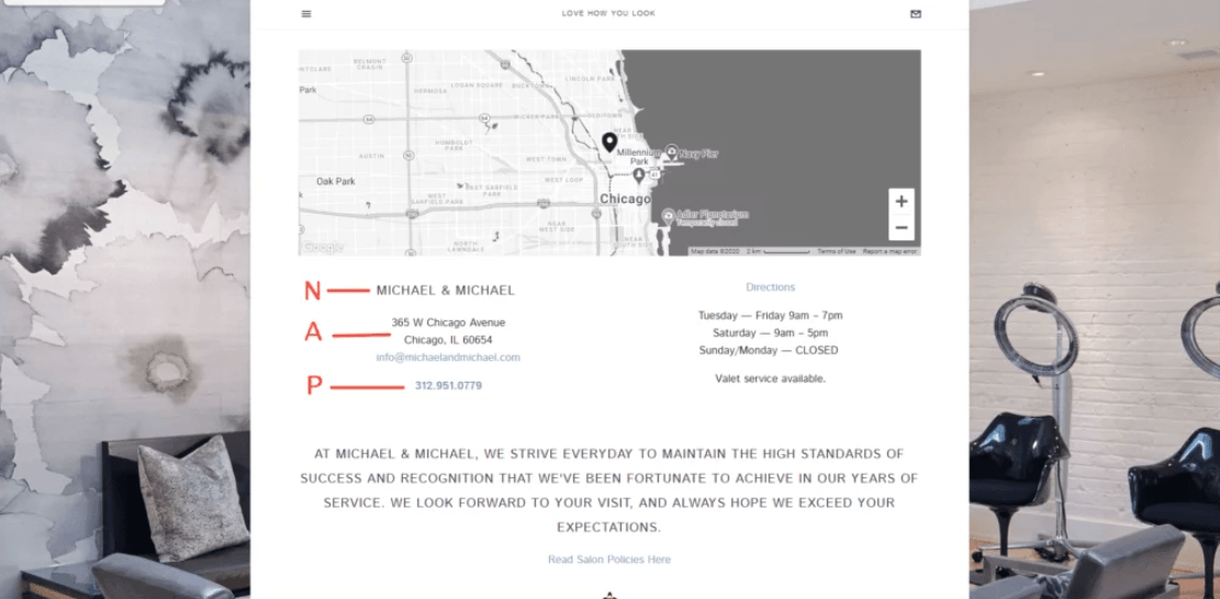
Your NAP needs to be correct and consistent throughout your entire page, and it needs to match the information in your Google Business listing. If the information differs (on the front page, in the footer, or across your service pages), it will confuse not only your potential clients but also Google.
So, make sure you recheck your entire site for NAP consistency. That is, your company name, phone number, and address on your contact-us web page should be exactly the same as the one you’ve listed on your Google Business profile.
2. List the areas your company services
Adding your service area is beneficial not only to end-users but also to Google. Among your potential customers, it establishes where they can expect coverage. Doing this helps you also rank higher in Google, as the search engine is more likely to recommend businesses closer to the customer searching for a solution.
Setting a specific service area works great for the company itself too. With it, you’re more aligned about who your customers are and what problems they face daily. In turn, this helps you create more relevant content – be it for SEO, advertising, or copywriting – which allows customers to identify their own problems and convert easier.
Additionally, it provides relevant signals to Google about the areas it should display your business on platforms like Google Maps when customers search for your keywords.
3. List your opening hours and holidays
Including your service area benefits both end-users and Google. By specifying your coverage, potential customers can know where to expect your services, resulting in a higher likelihood of being recommended by Google to customers seeking a solution.
Defining a specific service area also greatly benefits your company. It allows you to better understand your target customers and the challenges they face on a daily basis. Consequently, you can create more relevant content, whether for SEO, advertising, or copywriting, enabling customers to easily identify their own problems and convert more effectively.
Moreover, specifying your service area provides Google with valuable signals regarding the geographic locations where your business should be displayed, such as on platforms like Google Maps, when customers search for relevant keywords.
4. Write an optimized title and meta description
When it comes to SEO, few things are more important than customizing how your page appears in the search results. Relevant title tags and meta descriptions incentivize the users to click on them, which ultimately brings your more potential customers. We’ll look at exactly how you can write an SEO meta description and title tag for your contact page below.
5. List customer support team members
Listing team members on your contact page can be a good tactic when trying to avoid thin content. However, listing all of your team members can be excessive, especially if you’re a larger company. Instead, you can help users simply by listing employees who are directly responsible for handling customer issues. For example, you could only feature your customer support employees – in other words, the people that customers can actually reach.
Additionally, because you’re showing real people on your website, this helps build trust with your potential or existing customers. In turn, this can increase customer satisfaction and ultimately bring you more sales.
6. Add a contact form or chat support
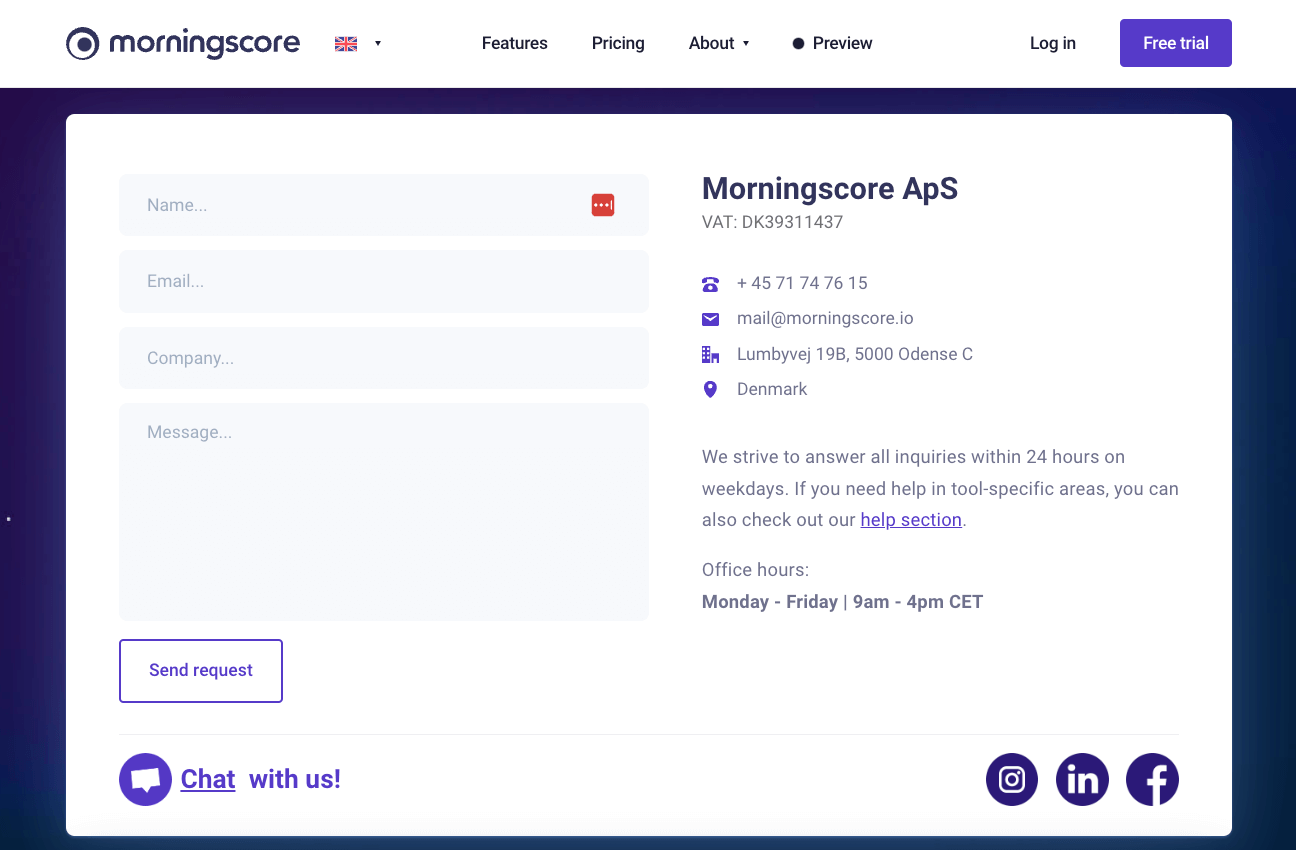
Adding a contact form on your contact page can help you make your contact page more interactive and avoid thin content. Even if an issue arises in the odd hours of the day, they feel more secure in that you can provide help.
Additionally, sometimes all customers need is to be heard, so providing that as an option can increase your customer satisfaction. And as you know, happy customers are more likely to do business with you again and recommend you to their peers, propelling your brand higher up in the search rankings.
Alternatively, you can opt-in for a chat support plugin. However, remember that in this case, you would be running external scripts on your page, which can slow down your website. On top of that, such JavaScript content is often harder to read by search engines and doesn’t directly provide you with any SEO value.
In any case, the bottom line is that one of these solutions is better than none. It’s always better to genuinely help your customers than focus on other individual metrics – as those other metrics are often a product of happy customers and can be influenced directly by them.
7. Use a compelling Call-To-Action
To optimize your contact page with SEO, we recommend that you add an effective CTA. Most often, the CTA on each page directly relates to the purpose of the page. And when it comes to contact pages, there’s one particular purpose – namely, customers getting in touch with your business.
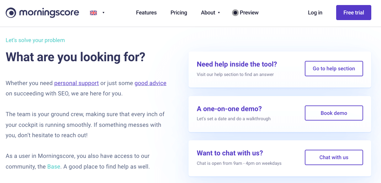
Doing this can improve the usability of your website and keep people for longer in your content universe. Keeping people on your website (of course, in a natural way) is a good indicator of having a strong brand that people are interested in. Over the long run, this can help improve your search engine rankings.
8. Add visuals of your physical location
Adding images and videos of your physical location is a great way for diversifying the type of media your contact page has, which can help your SEO. Additionally, it helps customers find the right way when in need.
Doing this is especially important if your premises are something customers interact with in some way, as it can be a great way to boost trust. A well-maintained physical location speaks well about the business and shows that you care about the problems you solve and the solutions you provide.
This is not limited to stores with physical locations. Even if you are an online company as we are that people don’t visit, it builds up the trust to show your actual location.
9. List any additional information
When it comes down to written content, a way to add more is to list any additional information that isn’t mentioned on other pages. For example, this could be alternative ways to contact you (e.g., fax) or if your customers can do business with you through third-party suppliers. Alternatively, if you have multiple ways for customers to get in touch, you can list your response times on each channel.
10. Add the ContactPage schema markup
A quick way to help search engines understand the contents of your contact page better is to use the “ContactPage” Schema markup. Schema is a global microdata web standard started in 2011 by the search engine companies Google, Yahoo, Microsoft, and Yandex and helps search engines return more informative results for users searching based on the web page’s contents.
Marking up your page with “ContactPage,” in turn, can allow search engines to display rich information about how customers can get in touch with you already in the search results. Doing so can make your search results more prominent with generally curious potential customers looking to contact a company in your industry.
11. Embed the Google maps widget
Another great functionality from a user point of view is to embed the Google maps widget to your contact page. Doing this allows users to quickly get an idea of the area where you’re located. Additionally, it adds more content to your page, making it more attractive for Google.
12. Add social proof, testimonials, or reviews
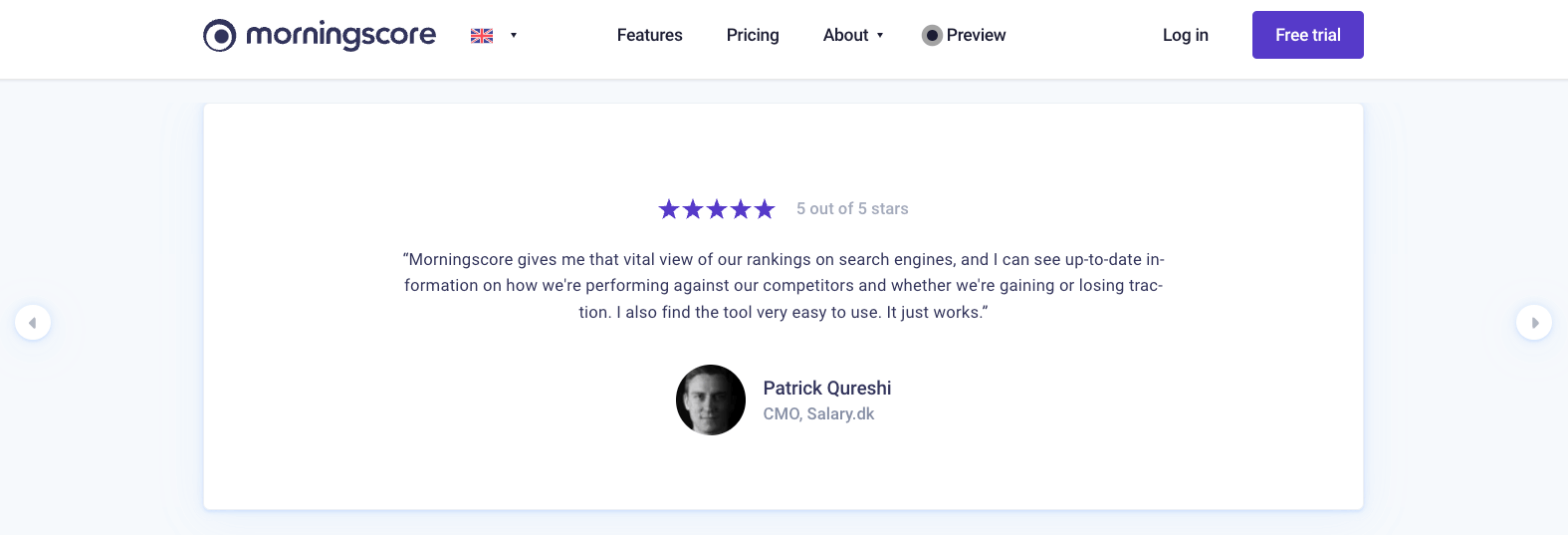
Prospects are highly likely to check out your contact page when deciding to do business with you. Because of that, it’s always a good idea to add some reviews of your company and product from previous happy customers. This can nudge your new prospects to either explore further or already do business with you. It is also a practice that boosts your credibility. In turn, this improves your branding, which is critical for SEO.
13. Create internal links to useful resources
Internal links are a great way to add more written content to your contact page because they are usually inserted contextually. Furthermore, they are critical when optimizing your pages with SEO. Thinking about internal links you can feature on your contact page often immediately inspires you to create content. And written content is yet another vital factor for ranking. For example, you can link to any helpdesk you have where customers can help themselves.
14. Add external links if applicable
If you offer products originally produced by other companies, you can also list your suppliers on your contact page and link to their sites. External links are important for SEO, and contextually linking out can also improve your trustworthiness with your existing and potential prospects.
Alternatively, most industries have some government organization that monitors and is responsible for all the companies in that industry. Where applicable, you can add an external link to the contact information of such authorities, work unions, certificates, rewards, etc.
15. Reiterate content from your “About” page
Lastly, if you’re still looking for more content to add to your contact us page, you can also rephrase some of the content from your about page. Specifically, what helps most customers is general information about your company and some specifics if you have multiple locations.
However, keep in mind that in-depth details about your company, such as those regarding the founding, your mission, vision, or day-to-day operations, are best left out simply because the contact page is supposed to be functional and quick to navigate.
Too much content on it, and you run the risk of confusing potential customers or customers facing issues. This information overload can also increase the chances of bad reviews from customers who haven’t been able to find the right way to contact you. In turn, this can hurt your online reputation, branding, and SEO – which are especially important for local businesses.
But what happens if your about page isn’t well-optimized? Worry not, as we have your back. Our about us page SEO article guides you through the exact steps to writing killer content that presents your company in its best light.
How to write an SEO meta description for your contact us page?
Things might look hard when it comes to writing a meta description for your contact page. But worry not, as we’ll show you exactly how to optimize yours. The thing to keep in mind here is the specific purpose of your meta description.
The most important function of your contact page’s meta description is to show users that they have found the right page they were looking for. As a general rule, your contact page SEO meta description should be under 160 characters, contain your keyword, and inform users they’ve found what they’re looking for.
Aim for a short meta description that is accurate to the page’s contents, as Google can rewrite less relevant meta descriptions. Additionally, while it might be tempting, don’t leave your meta description blank. Doing this can result in random content from the page being displayed. That’s because Google wants to provide any information possible about the page. Even though Google tries to pick the most relevant parts, usually, information isn’t structured in a “meta-description-friendly” way on contact pages. For example, in the image below, you can see that Google has pulled the text from some quick links from the page itself.

In contrast, writing a relevant description that is inviting can promote more clicks. Seeing a meta description like the one in the example below invites users to feel they have found the right resource they are looking for.

As you can see, this meta description is engaging – but also actionable. It uses verbs and action words and promotes the content the users can find on the page itself. For example, the sentence “Check out our catering menu here” gives the impression that users can find the menu readily available on the contact page.
This means that the company has found a great strategy to keep users for longer on their site – showing menus. Additionally, this also helps with adding content to your contact page – thus avoiding thin content.
If you’re looking to learn more, read our guide on how to write better meta descriptions for SEO.
How to write an SEO title tag for your contact us page?
Optimizing your contact us page title for SEO can seem intimidating. After all, it is important to get users to click on your result and not accidentally end up at your competitor’s doorstep. Because of that, let’s break down how you can write effective page titles for your contact us page without overcomplicating the process.
As a general rule, your “Contact” page’s SEO title tag should be around 50-60 characters long, feature your keyword, and inform users that they have found what they are looking for. Write concise title tags that stand out from competitors, invite users to click, and contain your brand name.
Additionally, avoid the trap of writing title tags for search engines. Although your title tag is a direct ranking factor, your primary goal is to write for users and optimize later for search engines. This will ensure your content sounds natural to users and isn’t automatically generated. It also means that as the algorithm gets better over time, Google won’t replace your page title with content from the page that it finds more relevant.
Also, similar to your meta descriptions, try to incorporate action words in your title tag. Phrases like “contact us now” make your page stand out among the search results because it incentivizes users to click on it.
Remember to have a short, concise page title as otherwise, Google won’t display it past the 50-60 character mark. Additionally, remember to front-load your page title with value, because otherwise, it can also get truncated, leaving users wondering what’s on it.
For example, always pull your main point at the front of the title. Afterward, include the supporting part of the headline after a delimiting character. In most cases, such characters are colon, comma, or the vertical bar (pipe) symbol.
However, here you can also use a smart trick to save some space. If you’re running out of space (e.g., in cases you have a long brand name), try to use some of the common abbreviations. Doing this will ensure that your page titles communicate the full value proposition while still fitting within the character limit set by Google.
Check out our guide on how to write better page titles for SEO overall.
Which SEO keywords are best for a “Contact us” page?
Using SEO keywords on your contact page can be somewhat tricky. That is because you want to include them – yet, use them in the right way. Using too many keywords on your contact page can confuse Google about what your page is about. To prevent that, let’s look at what keywords you should use on your contact page and how exactly to implement them.
As a general rule, you can include all keywords that explain what your business is about on your contact page. However, unlike landing pages, contact pages shouldn’t be optimized for any specific keyword. Keep your main keywords to a minimum by mentioning your top services in one to two sentences.
A “Contact us” page’s content is usually pretty thin, so you won’t have the opportunity to write these keywords more than once anyway – which is good. You are not optimizing this page for any specific keyword as you do with your landing pages.
Instead, you mention keywords that show the essence of your business, so it’s easier for Google to show your business address in Google Maps of the Local map pack. As an example, here’s our sister company Morningtrain. As you can see, you do not need more than two sentences to mention your top services.
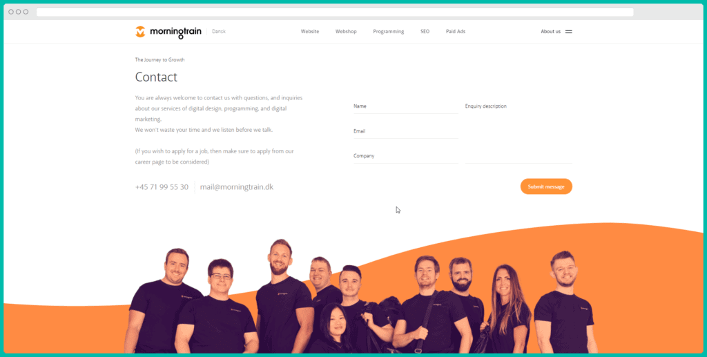
You can also use some generic keywords that people use when doing searches for local businesses. These are “where is X,” “Y near me,” and “find a Z.” It would be good if you could use any one of those on your contact page, but make sure it looks natural and not forced.
For example, you can write a sentence like “Trying to find a good dentist near Preston Road? We are located at Jameston Rd, just 200 feet from Preston Road”. Doing this allows Google to pick up on the context and rank you better for the more generic searches we mentioned above which you’ll be able to monitor using a keyword management tool.
5 best “Contact Us” page examples
We’ve looked at some concrete ways to improve your contact page SEO and user-friendliness. And now it’s time to get the creative juices flowing. Here are some of the best and most creative examples of contact pages (which you can show your digital marketing guy or website designer 😉).
1. Contact Page Example – Website.com
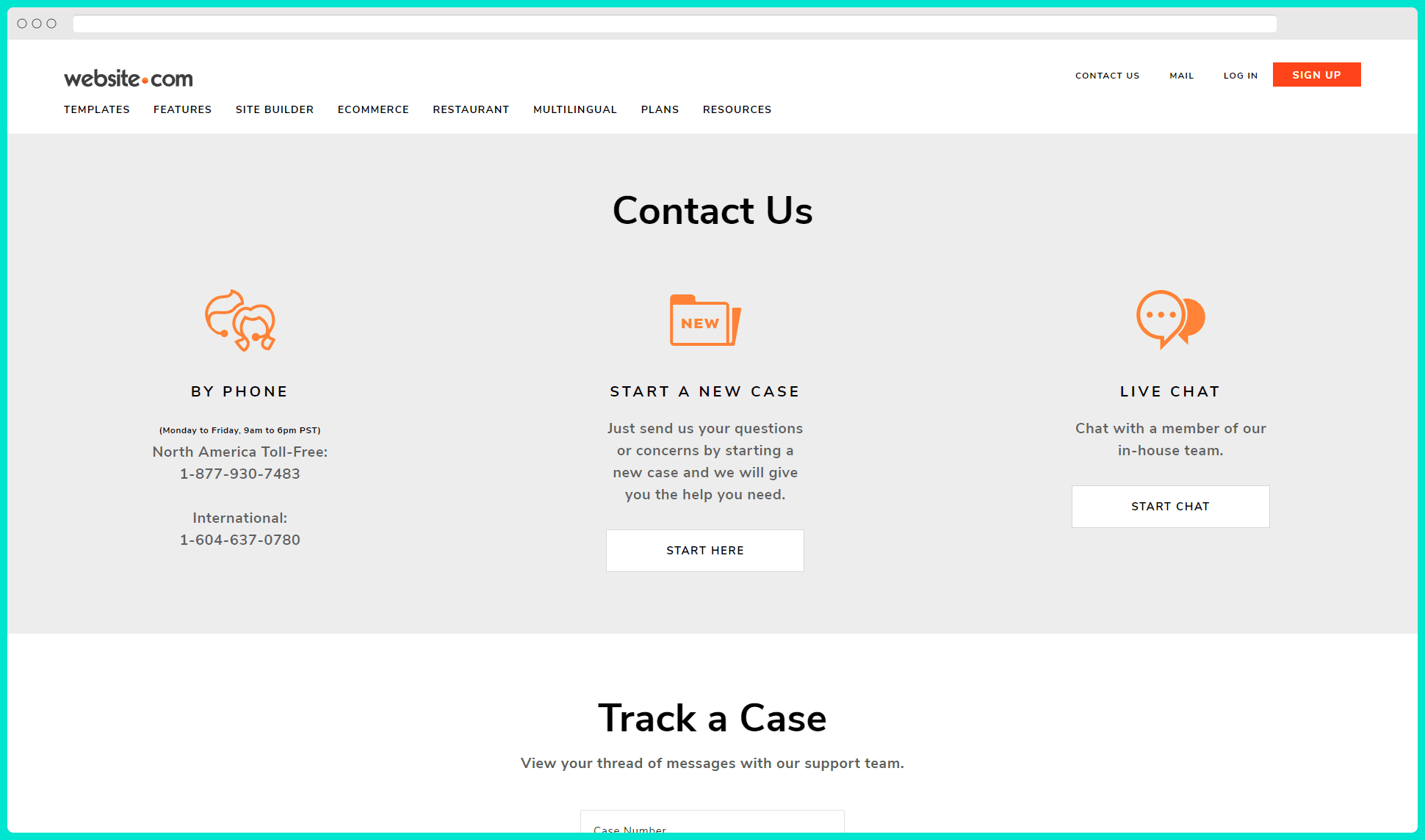
The first example is a simple yet effective contact page from the domain website.com. Here, you can see that they feature what some would consider a timeless design because of how things are arranged.
As you can see, throughout their page, they’ve listed their exact NAP information to fully SEO their contact page. Additionally, they feature very relevant Call-To-Action buttons that assist the users in exploring this page.
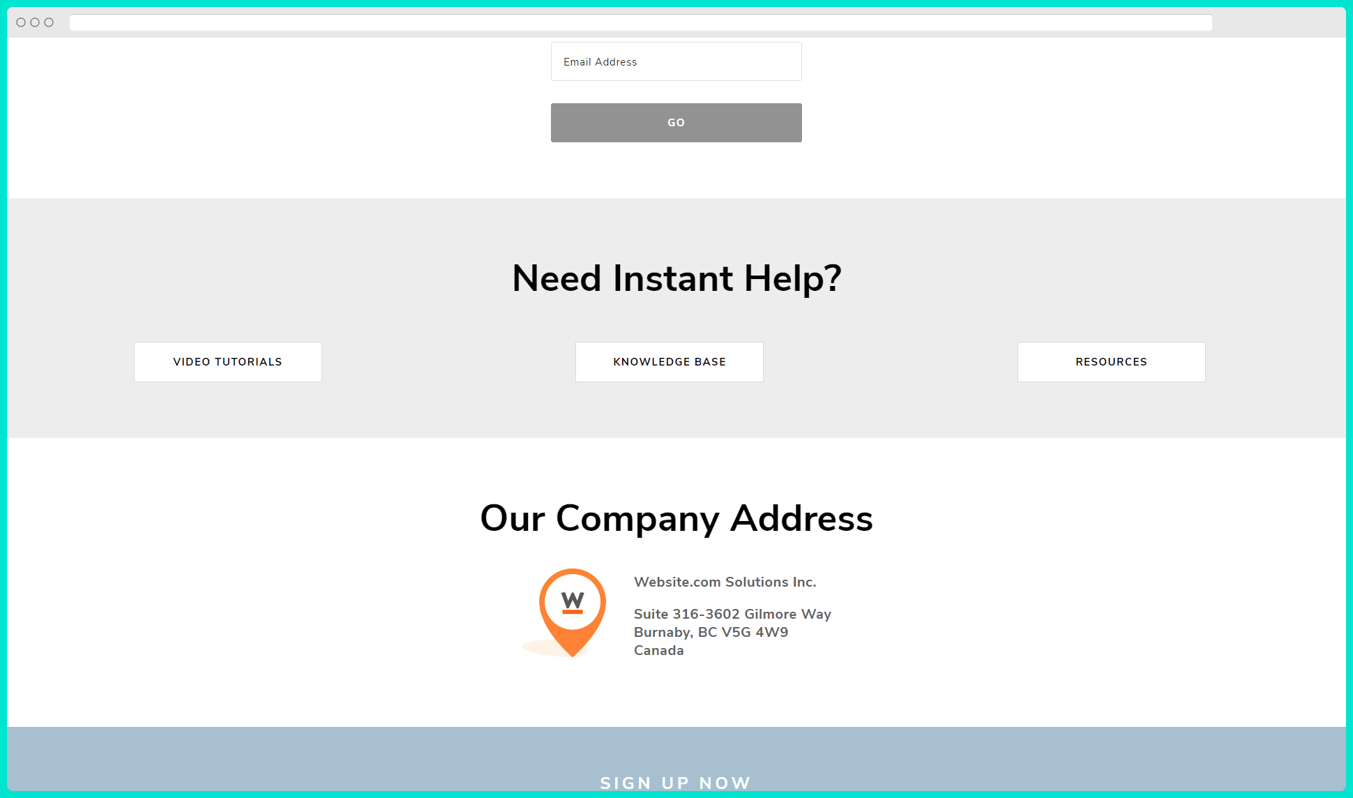
That is, you can either open a support ticket, start a live chat directly with their team, or see the status of their current open tickets. Better yet, they have integrated their learning center on their contact page with minimal effort. There are simply three buttons, each leading the user to their Video Tutorials page, Knowledge Base, or Resources page.
2. Contact Page Example – T-Mobile
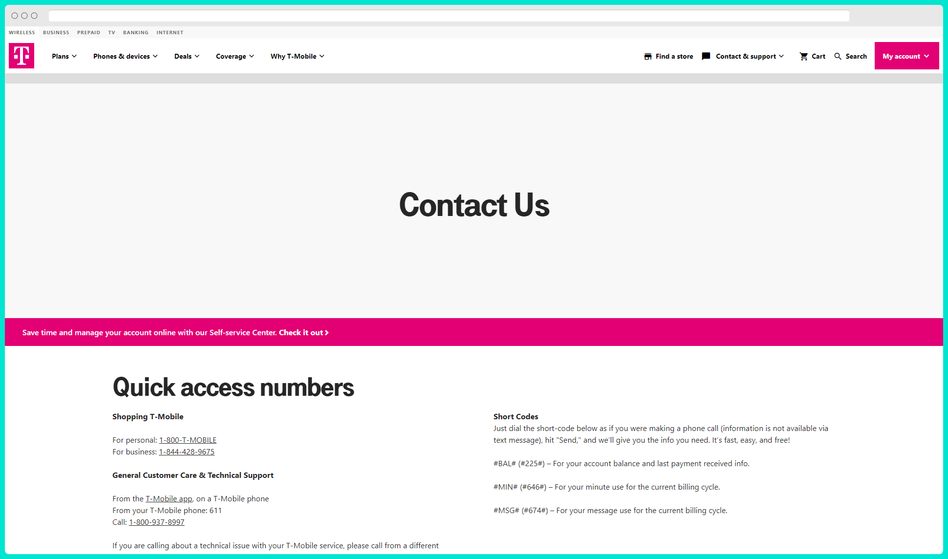
Here’s yet another great example of a contact page. At the very top of their page in the Above-The-Fold section, the first thing the user sees is a call to action line prompting them to use their Self-Service Help Center. This gives the user an option to find quick answers without waiting for customer support in a queue. It also helps T-Mobile deal with its great demand for customer support – and operate a more profitable business.
As expected, T-Mobile has also provided contact information for both businesses and individuals. This is a great option for having the best-suited staff members for the task to help the two types of customer profiles they have.
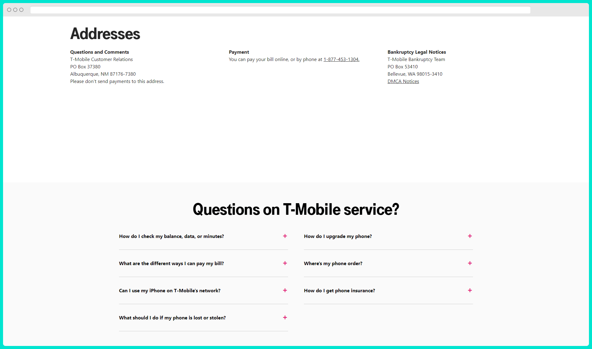
Scrolling down the page, we also see they’ve done both themselves and the customers a favor by directly listing their contact information regarding Payments and Bankruptcy.
And last but not least, they understand that some customers might not find out how to navigate to their Self-Service Center. Because of that, they also list their most Frequently Asked Questions directly on their contact page, reducing friction and helping customers. T-Mobile is truly a great example of a well-done contact page SEO!
3. Contact Page Example – Samsung
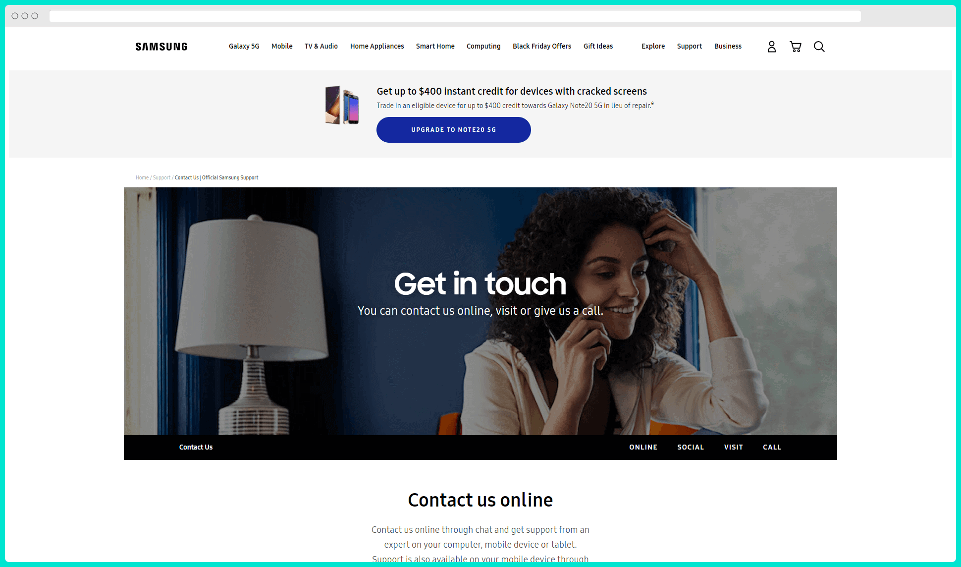
Next up on the list is Samsung’s masterfully crafted contact page example. Unlike T-Mobile, Samsung doesn’t focus on sending people to a Help Center in their CTAs, potentially because some customers are conditioned to assume that they can’t find what they are looking for in it.
Instead, they maintain an active community of members who assist each other. In some ways, having a community of people working with Samsung also builds trust in the end-users – since they believe many others might have experienced the same issues that they could be dealing with.
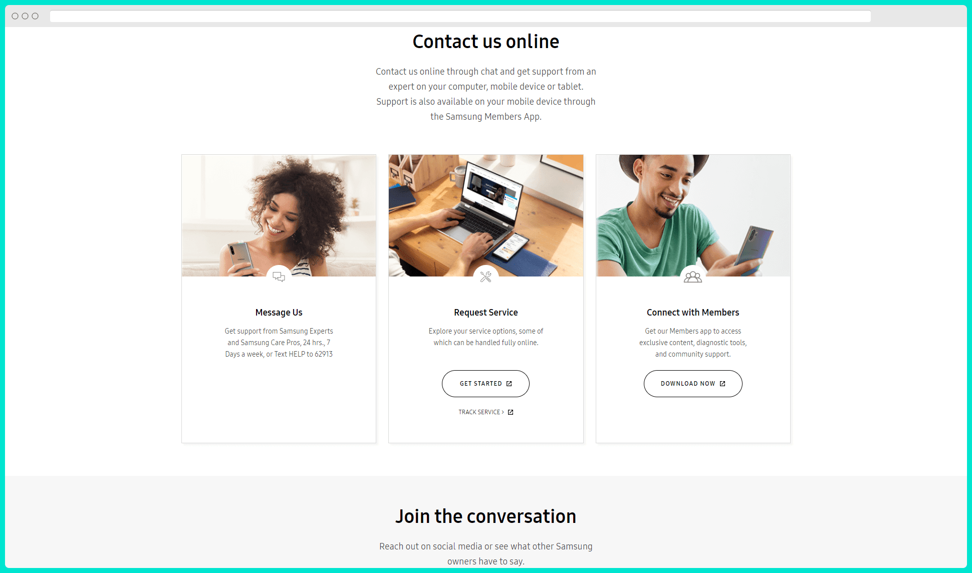
This, therefore, gives a form of security for the end-users because they feel the answers to their questions are more personalized, and they get the attention they deserve. This is especially true for companies who have somehow built a bad rep for their customer support.
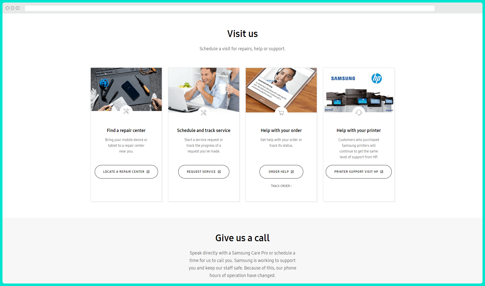
As you can see in this example, similar to T-Mobile, Samsung has tailored the page to their users’ different needs. They understand that their customers are struggling with a plethora of things, and therefore, provide other supplementary CTA buttons lower down the page. In this case, those are Locate A Repair Center, Request Service, Help With Order, and Printer Support.
However, one thing that stands out with pages for such large companies is that they often do not list an exact NAP for SEO purposes. The reason for this here is because Samsung has dozens of offices throughout the world. Also, they probably have just as many licensed locations which they don’t necessarily run themselves. Adding an exact address on their contact page in this scenario would be problematic for both their customers and Google.
Instead, the purpose of their global contact page is mainly to offer help digitally. And the way they integrate their physical locations is through their Locator page, where you can find their repair centers.
4. Contact Page Example – The California Beach Co’s
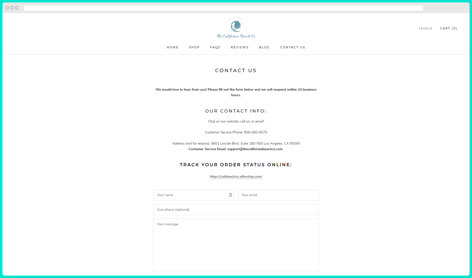
Up until now, we looked at a few great examples. Although you might assume that the concepts apply to global companies, that isn’t necessarily the case – and you can also use similar ideas and modules on your contact page.
However, let’s now look at an example of a more relatable case for most of us. Namely, this example of a contact page with great SEO is from the company “The California Beach Co,” which sells beach tents and blankets through their e-commerce store.
As you can see, they’ve done a great job of keeping things simple. There isn’t anything extraordinary about the page – but there isn’t any information missing either. My personal preference would be to add a bit more content around the page. But if the current version is sufficient, that’s great, too!
On their contact page, the company has listed their contact phone number and address. Additionally, as we mentioned above in the guide section of this article, you can see they’ve done their customers a big favor. That is, they feature both a contact email AND a contact form on the same page. This is great for customers who get in touch through the contact form and those who prefer to write to them directly.
Last but not least, they also feature a link to a helpful resource for most customers – the Track Order Status.
5. Contact Page Example – Bridport Car Repair Centre
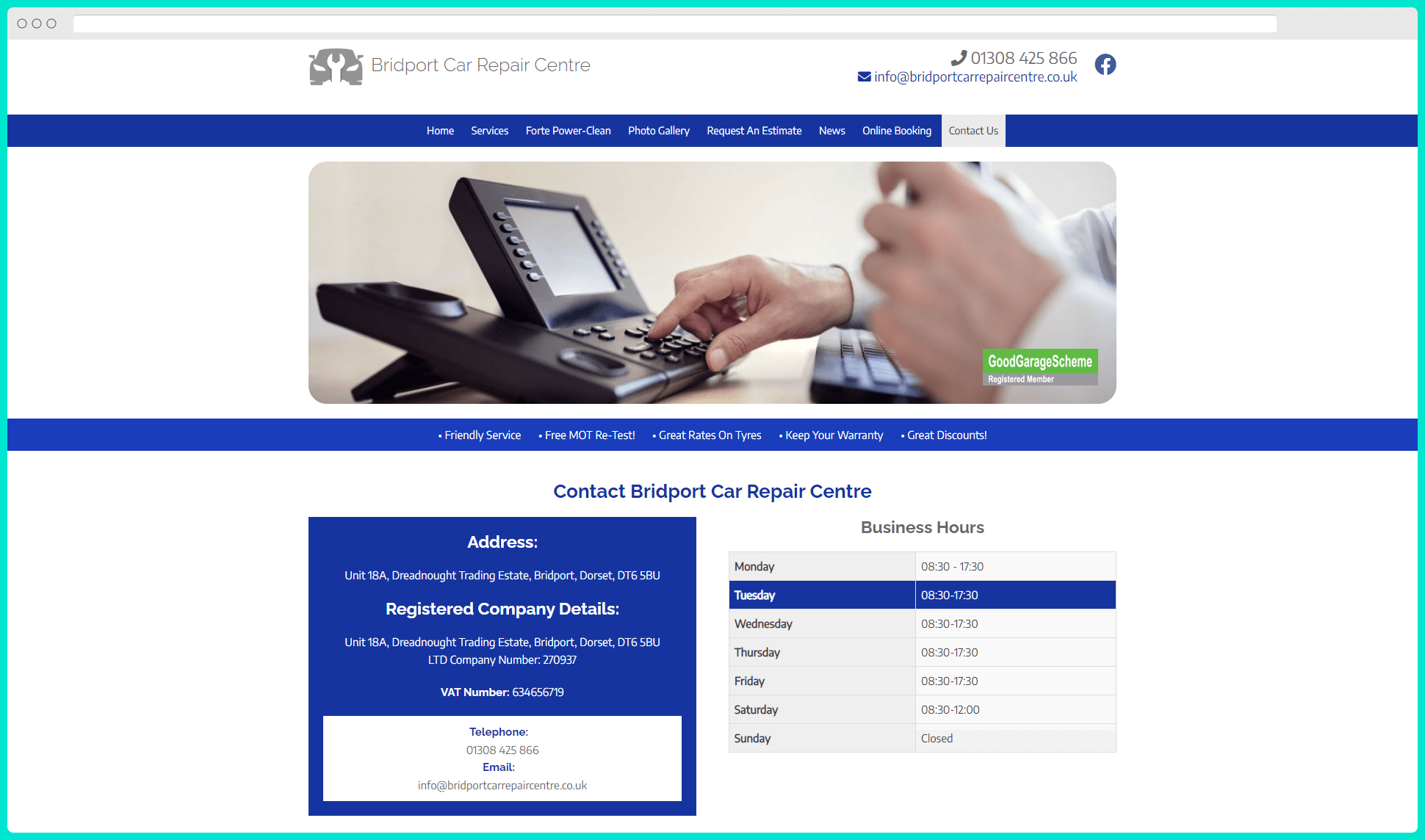
Now, I absolutely love this last example. We’re looking at the contact page for a vehicle service center in the United Kingdom. One thing that stands out right away is that they certainly understand the importance of their contact page – and how customers and potential customers use it.
Landing on that page, straight off the bat, you see their very detailed NAP information listed in a blue box that stands out on the page. In it, they’ve listed not just standard contact information such as NAP, but also other very relevant company information that can help their business partners, such as their Company Registration Number and VAT Number.
Next to that, they list their business hours, with an excellent little detail which highlights the current day which you’re looking at in the table. As a customer, I love that, even if I don’t consciously notice it right away. It saves me mind space – which I’ll probably spend on doing business with them instead.
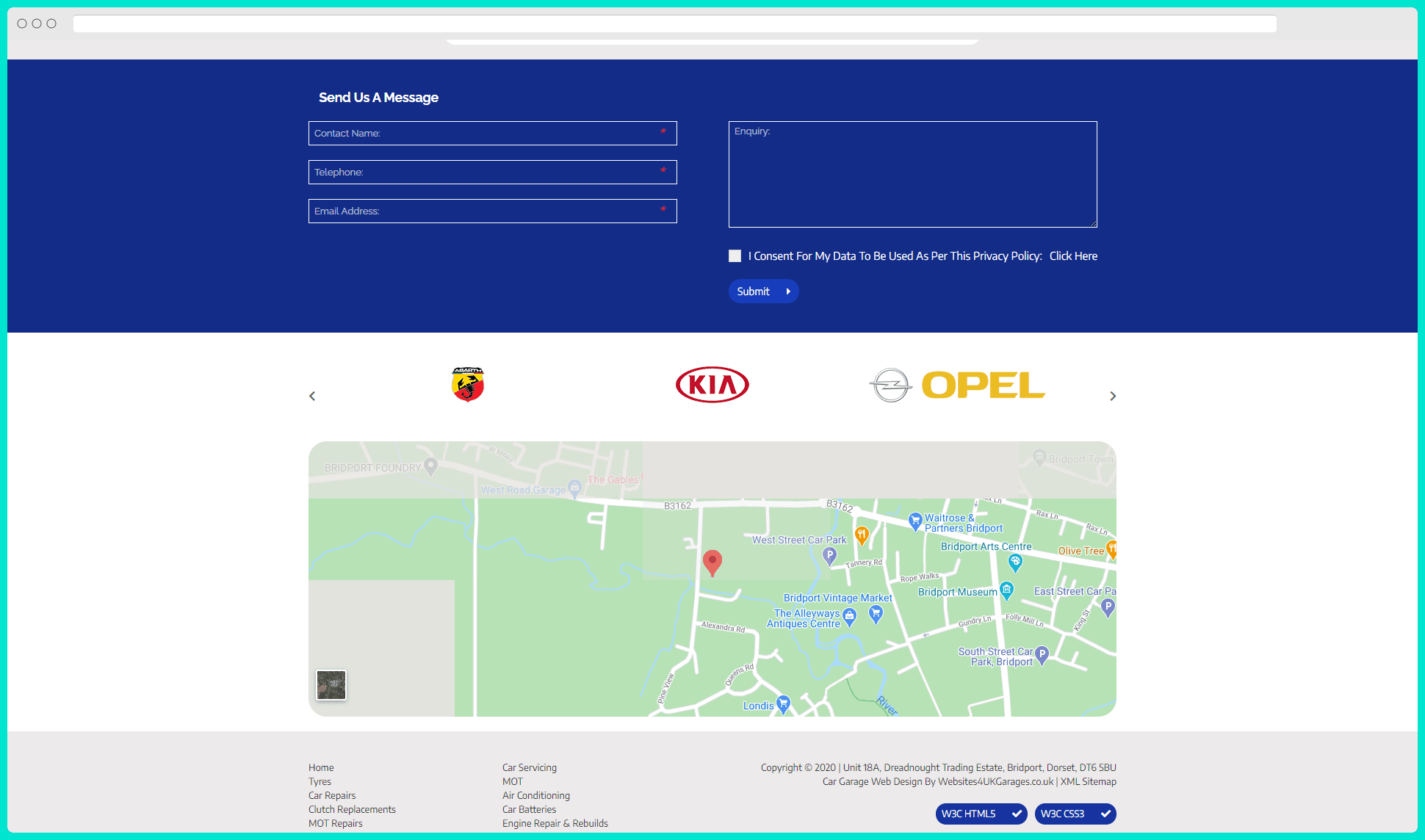
Besides that, scrolling further down reveals that they’ve listed both their contact email and a form. And to end the page, they also have a Google Maps integration which visually points out their address on the map. What a good combination.
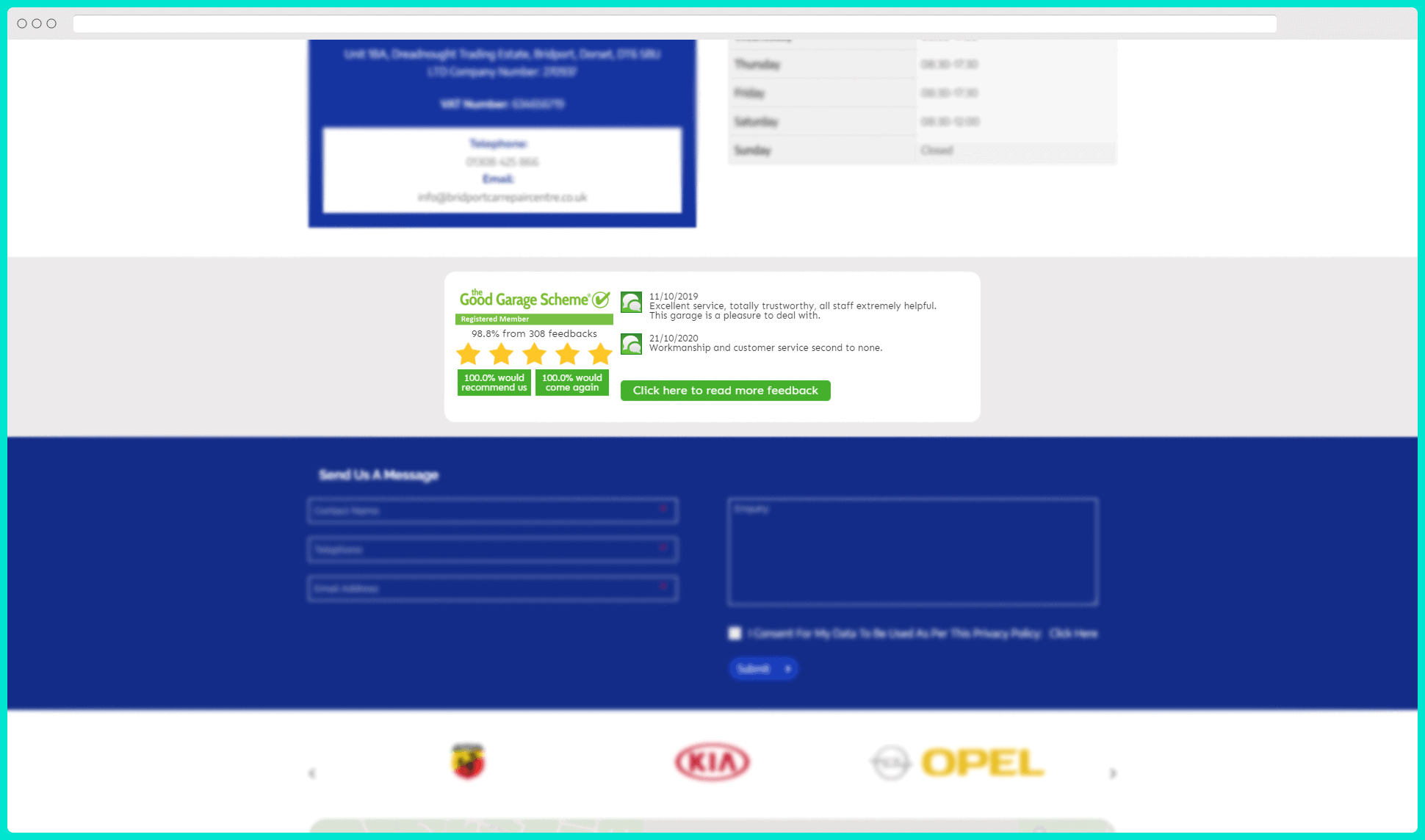
But before we end this, let’s note one more little detail on the page. Masterfully crafted, they’ve added possibly the best Social Proof – a slider with customer reviews.
Conclusion
I hope this article gave you some ideas, and that you are itching to make your contact page perfect. You will make your website visitors happy, and hopefully, Google rewards you with a few ranks or a local map pack listing.
If you are a webshop owner, you should check out our eCommerce SEO article and learn more about all the ins and outs of optimizing these specific business sites.

