With an astounding 62% share in website traffic (Recent 2022 survey) SEO is the worlds biggest traffic channel. Optimizing your website for search engines should therefore be a high priority.
Let’s dive in:
1. Make your URLs discoverable by using a sitemap
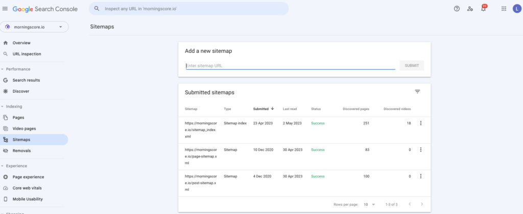
In essence, sitemaps are XML files that list all of the crawlable URLs on your website, together with some metadata such as the date they were published. Submitting this file to Google Search Console enables Google to find your new pages faster and more efficiently.
This feature is especially great for pages that do not have many (or any) internal links – which Google would otherwise have a hard time discovering.
Most modern CMS platforms like WordPress have plenty of plugins (similar to Yoast SEO) that enable you to generate and maintain your sitemaps automatically. In some scenarios where you’re using a custom-built website, you can use a tool with a sitemap generator feature like Screaming Frog. However, keep in mind that manually generated sitemaps need to be regularly regenerated. Otherwise, they won’t feature URLs published after you’ve originally created them.
2. Link important pages in the footer
Most websites have only a few pages that truly deserve their place in the main navigation. Because of that, and to avoid cluttering, a great option to effectively interlinking your website is to link your important pages in the footer.
Footer links aren’t a huge direct factor for SEO itself. But they are a great User Experience factor – and can indirectly improve your website’s rankings.
Footer links naturally promote your users to explore the content on your website. That is, even if a user came for a different reason, they open the opportunities for them to find relevant content and, as such, learn more about your company. This way, they improve your branding – and having a strong brand is an important factor for ranking easier and higher in Google Search.
To give you a practical example, here’s our Google Analytics showcasing the entries towards our software’s development roadmap from all other pages on the website.
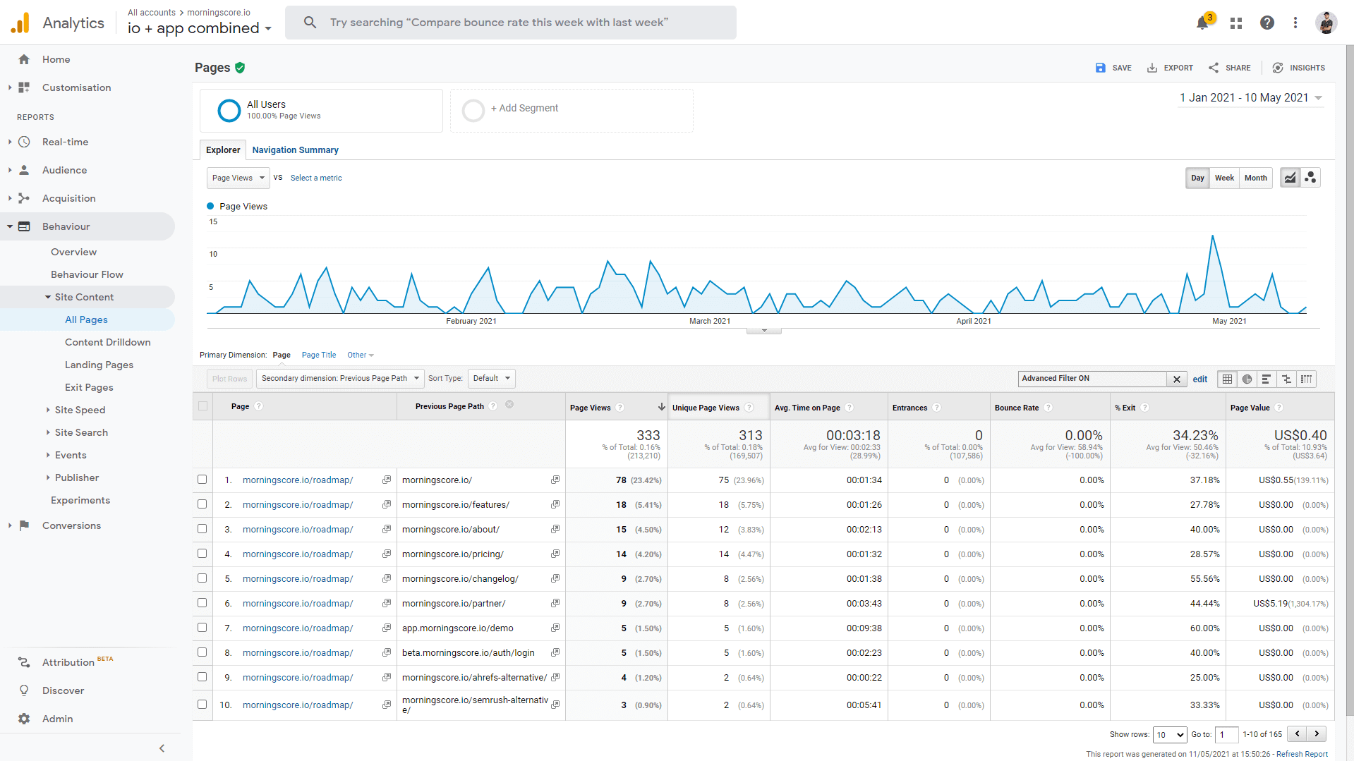
As you can see, in roughly 5 months, there have been over 300 page views – with an average time on page of more than 3 minutes. In general, this means there have been over 300 opportunities to create brand ambassadors. What a great return on investment for simply adding that page to the footer!
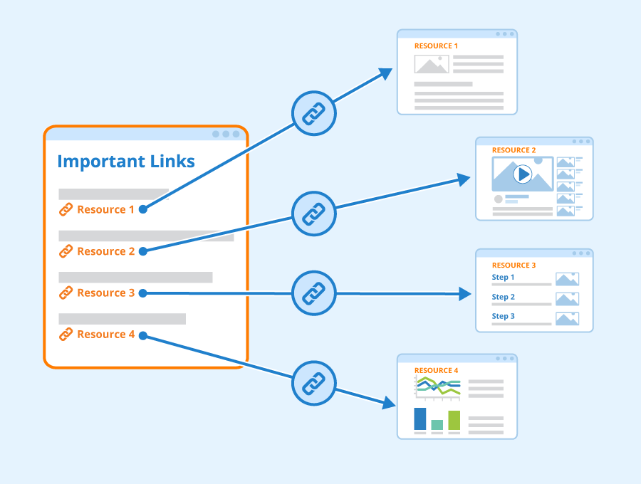
3. Add internal links between important pages
Internal links are not only a great way to engage users by providing them with more relevant information but also help your pages rank higher.
A good and contextual internal linking structure allows search engines to better understand your content. They are yet another signal that Google uses to create a “topical cluster” for your website.
Additionally, as a side benefit, internal links help search engine crawlers discover the individual pages on your website. This is especially important if you decide not to create a sitemap, as otherwise Google won’t be able to find and index your new pages.
You shouldn’t see your internal links as a replacement for your sitemap or vice-versa. Internal linking also helps Google understand which pages on your website you find more valuable. The more prominent a link on your website is (of course, within a reasonable amount), the more you indirectly tell Google that you want users visiting this page – and that it is a valuable resource.
Furthermore, sitemaps don’t provide the benefits that internal links bring in terms of passing “link juice” between your pages. As such, a sitemap doesn’t directly influence your rankings as much as internal links do. Because of that, they are both meant to work together.
4. Implement SEO-friendly “hub pages”
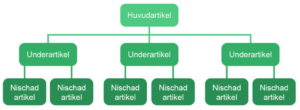
Hub pages, also known as topic clusters and content hubs, are yet another important factor when restructuring or creating your website. Hub pages are pages that host topically relevant content sub-pages. Essentially, their role is to create a hub of content that both Google and the end-users find relevant, well-structured, and well-optimized.
For example, if your website focuses on marketing, this can present itself as a very large subject. Because of that, breaking down “Marketing” into relevant hubs can improve the SEO performance of each of these hubs. Building upon the example, such hubs would be “Content Marketing,” “SEO,” “Facebook Ads,” etc.
Each of these serves as its own “pillar of content,” where users find only the most contextual articles. This way, users can naturally explore the content and find more relevant articles. It’s also easier for you to interlink your content and thus create a topically relevant “net of content.” And naturally, this can promote your pages in Google Search.
In comparison, if you do not feature those hubs and only have the general “Marketing” category, your blog can look messy. Users will have a hard time finding the content they find relevant. Similarly, Google will also have a harder time building a “contextual map” of your site.
This can hurt you because it prevents you from establishing your site as an authority on your subject. And as we’ve seen, in recent years, the trend of ranking well in Google is shifting towards subject matter experts. This is a great segue into the next tip.
Author: Seobility – License: CC BY-SA 4.0
5. Improve your SEO’s E-E-A-T with “author pages”
In SEO, E-E-A-T stands for Experience, Expertise, Authoritativeness, and Trustworthiness and is part of Google’s Quality Raters’ Guidelines.
For simplicity’s sake, you can think of EEAT as credibility. In other words, are you credible enough to write about (and rank well) your subject? Some subjects require less EEAT than others. For example, while always beneficial, more hobby-orientated subjects like handcrafting do not require as much credibility as finances and health.
Regardless of the strength to which EEAT is present in your niche, SEOs agree that it’s a critical element for ranking – and is only bound to become more prominent. As such, you need to implement it on your website as well.
In practical terms, this means showcasing your credibility by having dedicated pages for your authors. There, you can (and should) showcase as much credible material as possible – from education and certifications to previous work experience and collaborations with authoritative figures in your niche.
To add to that, make sure that all of your blog content has an author assigned to them. This way, you’re not only leveraging your existing credibility but also building more for the future.
Similarly, some content requires more credibility which you can leverage by bringing in experts. Many articles in the financial and medical sectors are now vetted by professionals that check the correctness of the content.
Lastly, as a side note, E-E-A-T also has a lot to do with off-page SEO. Being featured in relevant media outlets and websites certainly helps your credibility in real life – and as such, it helps your online presence as well.
6. Utilize a mobile-friendly responsive design
Once you’ve laid out your SEO-friendly website structure, it’s time to consider one of the most important modern SEO aspects: mobile-friendliness. It’s no secret that Google’s Algorithm prioritizes websites that are well-optimized for mobile devices. After all, 56% of all traffic in 2021 came from mobile devices – and the trend will only continue.
Because Google knows that, its algorithms are optimized to provide a great User Experience not only to everyone sitting on their computers – but also to those searching from mobile devices. Consequently, Google has also upgraded their own crawlers – and now most well-ranking websites are crawled with their mobile crawler “Googlebot smartphone.”
You can see whether Google uses this crawler for your website in Google Search Console. However, even if you see “Googlebot Desktop,” remember that eventually, all websites get switched to mobile crawlers – and as such, your website must be ready for the change.
And that is important because mobile devices come with their own limitations – from slower processors and networks to smaller screen sizes. As such, websites that rely on Google need to adapt and create fast and responsive websites. There are two main aspects of optimizing your website for mobile devices.
Firstly, you need to ensure that your website is up to the technical standards that create a great user experience. Doing this includes having a fast-loading website that scales well on mobile devices and doesn’t feature intrusive elements like popups and horizontal scrolling.
Secondly, and still equally important, is optimizing your content for mobile devices. This includes the font size of your main text and headings, having a well-structured page layout where mobile can see all content, and featuring optimized images that are easy to see on mobile. Therefore, simply hiding elements on mobile isn’t enough.

7. Add your most important pages to the main menu
Following up on the previous point, when considering the layout of your website – including its mobile version – you need to take a strategic look at your navigational menu.
It should come as no surprise that SEO-friendly websites have great navigation. In the past few years, the trend in SEO has clearly established itself as providing the most helpful experience to the end user. In other words, SEO and UX are merging at an ever-increasing rate.
As such, when designing your SEO-friendly website, your goal should be to make it as helpful and easy to navigate as possible. One great way to do this is by structuring your navigational menu so that it promotes the pages you want your potential customers to see.
For example, if you’re a service company, your main menu should feature pages with the individual services you provide. If you offer products, you can take a similar approach by showcasing the categories for your products. For bloggers, such pages are the blog topic categories.
Doing this also invites Google to crawl and index more of your pages. After all, these are the most valuable pages on your website. Adding internal links from the navigational menu ensures that Google recognizes that, too.
💡 Pro tip: Consider creating a mega menu to really push all your important SEO pages front and center
Here is an example from video tool veed.io – I think they do SEO really well in general and have used mega menus in a smart way to get Google and visitors to see their huge arsenal of SEO pages:
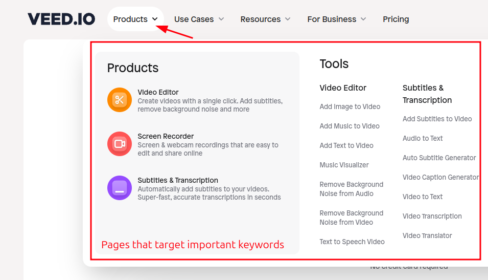
Why do this? Several reasons, but no. 1 reason for SEO: Now all their important SEO pages have a ton of internal links from the main menu, signalling to Google that these pages are important and should be ranked.
8. Set up an SEO-friendly URL structure
Talking about pages, let’s take a deeper look at the elements that make a page – namely, the URL structure. SEO-friendly URLs are critical for ranking high in Google and work as an indirect factor that improves or worsens the User Experience.
In other words, featuring a keyword in your URLs on its own will not rank your website high – however, not doing so can hurt your potential for ranking high. That is because, similarly to your page title tag and meta description, users intuitively understand the contents of the page they click on from your URL. Additionally, search engines like Google use the URL in order to understand the contents of your page.
A user is more prone to clicking on an URL that matches their search rather than a generic one that doesn’t indicate what’s on the page they are about to visit. Because Google uses such User Signals to judge whether a page deserves to be at the top, URLs play an important role in convincing users the page is relevant to them.
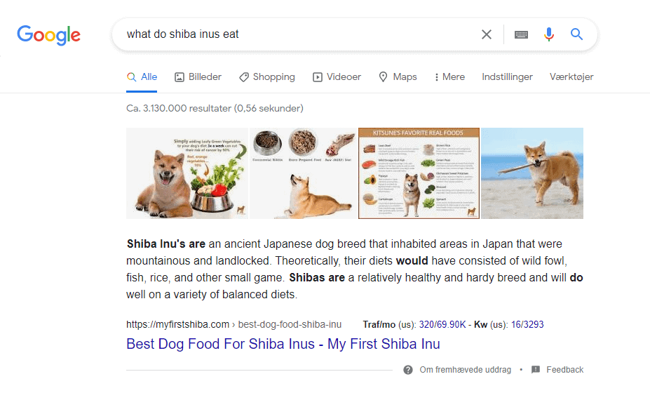
Consider the following example. A user searches for “what do shiba inus eat.” A badly optimized URL contains numbers, has many forward slashes (i.e., “partitions” or “subfolders”), and does not provide relevant context to what’s about to appear on the page.
Contrary to that, good URLs match the search phrase of the user very well – and thus provide relevant information about the page. In fact, you can see this trend all across the search results. Most well-ranking websites on page 1 have an SEO-friendly URL.
Lastly, having well-optimized contextual URLs also helps returning visitors, as web browsers like Google Chrome and Mozilla Firefox offer live URL suggestions when the user types into the search bar.
9. Ensure robots.txt and meta robots allow crawling
We’ve covered how to help Google find your pages – but what about their crawlability? The most severe mistake you can make from an SEO perspective is to disallow search engines like Google from indexing your website.
Correctly setting up your robots.txt file is critical in allowing search engine crawlers on your website. Similarly, you can also de-index important content on a per-page basis using the meta robots tag.
As such, you need to ensure both of these are set up correctly so that Google is allowed on your website.
This is a common mistake that less-experienced SEOs or website developers can allow, especially during website redesigns and migrations. That’s because websites under construction are usually set up on what is known as a “development environment” so that the live website can still function on the side.
Now, neither of these settings is complex; however, their effects can be quite harsh. It’s always a good idea to regularly check if your robots.txt file is functional (or even there) as this document is quite important for the health of a website. We often recommend that people regularly use a tool to crawl their website – which also highlights other important website health issues.
10. Improve the UX by reducing page load times
The technical setup of your website is essential in SEO as it impacts the User Experience. Having a fast-loading website is one of the core aspects you need to focus on if your goal is to create an SEO-friendly website.
Furthermore, fast websites have better performance on all other business metrics as well. A 100ms reduction in the website load time improved conversions by 8.4% for retail websites. Similarly, it increased conversions for travel websites by 10.1%.
But there’s more. If you have a slow-loading website, this can also discourage Google from crawling and indexing all of your URLs – because it has to spend considerably more time on them.
In fact, even if Google is able to find and index your pages, it understands that your website’s performance is not optimal and will not provide a good User Experience. As such, they are likely to demote your site from the Search Results.
Here are some areas where you can improve your page load times:
- Remove unused scripts
- Minimize scripts
- Add server-side caching
- Add caching to your website
- Optimize images
11. Optimize images
Talking about images, let’s look at how they impact your website’s SEO-friendliness. Excessively large images are one of the lowest-hanging fruits when it comes to optimizing the speed of your website.
Firstly, you need to ensure that you’re using the right image formats for the job. JPGs are great for actual photos you’ve taken, while PNG is optimal for digitally created graphics.
Next up is the resolution of the image. Most desktop screens work with 1920×1080 pixels, while mobile phones have 1080×1920 pixels. As such, uploading huge images is unnecessary – you will not notice a significant improvement in quality, while the size of the image will be excessive.
In fact, in many instances, it’s perfectly acceptable to use images smaller than that, too. That’s because we rarely see the images full-screen – and when they are featured on, say, your blog, they are naturally going to be shrunk by the blog’s layout and bounding box.
Additionally, with the help of an online image compression tool like TinyPNG, you can easily half the size of your images. For both landing pages and blog posts, the user has to download smaller files – and thus, the page loads faster. The best part is that there’s no visible difference in the quality after compression, even for the trained eye.
Consequently, many plugins help you lazyload images, further reducing the time it takes for your website to load. And in some instances where your content revolves around using many images, using a Content Delivery Network might be a great solution as it takes the load off of your main servers.
Lastly, as part of SEO’s best practices, remember to name your images something relevant – and include an alternative text that helps Google understand its contents. This can boost the rankings of your main content on the Search Engine Result Page and bring you some relevant traffic through Image Search.
12. Set the right hierarchy for your Heading tags
Another important element for SEO-friendliness is the structure of your H-tags. Heading tags are critical for two things. Firstly, they provide a contextual hierarchy of the contents of the page for search engines so that they can understand what the page is about. Secondly, they are important for the end-user. That is, they don’t only communicate your point across but also get the user to spend more time on your page and read further. For example, well-written headlines aim to incentivize the reader to explore your content. As such, there are some important practices you need to incorporate when writing headlines.
Firstly, make them incentivizing and actionable. Use power words to communicate to get the user excited about what’s coming. Similarly, use your main keywords and variations of them in the headings. Furthermore, short and sweet headings help the user skim through the content and find what’s most relevant for them. Lastly, try to make your headings non-obvious.
Everyone has read posts where all you need is the headlines – and you don’t want your content to be one of those articles. Together, these three tips ensure the user finds your content relevant as it provides context.
The last important thing to note here is that your headings set the hierarchy of your content on the page. Similarly to a school report, your pages need to have a certain hierarchy that thematically links the continents. In the case of a web page, those are the H-tags. Always aim to have only one H1 tag on the page, as this sets the “topic” for the page. From there on, major turning points in your texts can be set as H2 tags – with H3, H4, H5, and H6 serving as sub-headings for their relevant parent H2 tags.
13. Write unique title tags and meta descriptions
The title tags and meta descriptions are very important for actually gaining something from all of your SEO efforts. Even well-optimized websites can struggle with attracting users from search engines if their pages aren’t perceived as incentivizing enough by the end users.
That’s because your page title and meta descriptions, in a way, work as a promotional banner. Their content and the message they relay directly influence the user – and determine whether they are going to visit that website or click away. Your goal here is to make unique meta content for each page that the users find relevant and interesting enough to click on.
14. Avoid thin content
- You need to ensure that none of your pages are shallow.
- I would recommend: Having at least 100 unique words on all your pages.
- This is the minimum. +500 words are often needed to rank.
15. Create SEO-friendly site architecture
One of the most important things to consider in order to make your website more SEO-friendly is the architecture of your website. The hierarchy in which your pages are structured directly impacts how search engines understand them. This is especially true for eCommerce sites and sites with many pages.
Naturally, on any website, some pages are more important than others. Because of that, Google wants to see them organized in an “intuitive” way so that both machines and users can make sense of it.
Credit: this Swedish article on site structure is a great quick overview.
Bonus: 4 great examples of SEO-friendly websites
Now, let’s examine some practical examples of SEO-friendly websites. For this breakdown, we’ve intentionally selected 4 websites, each of which serves a unique purpose. This way, you can both find the most relevant use-case for your own website yet also gain ideas from other industries. The websites we’ll be examining are in the following niches:
- Service company
- Ecommerce store
- SaaS startup
- Blogger
Let’s do the breakdowns!
Example 1: an SEO-friendly web design for a service company
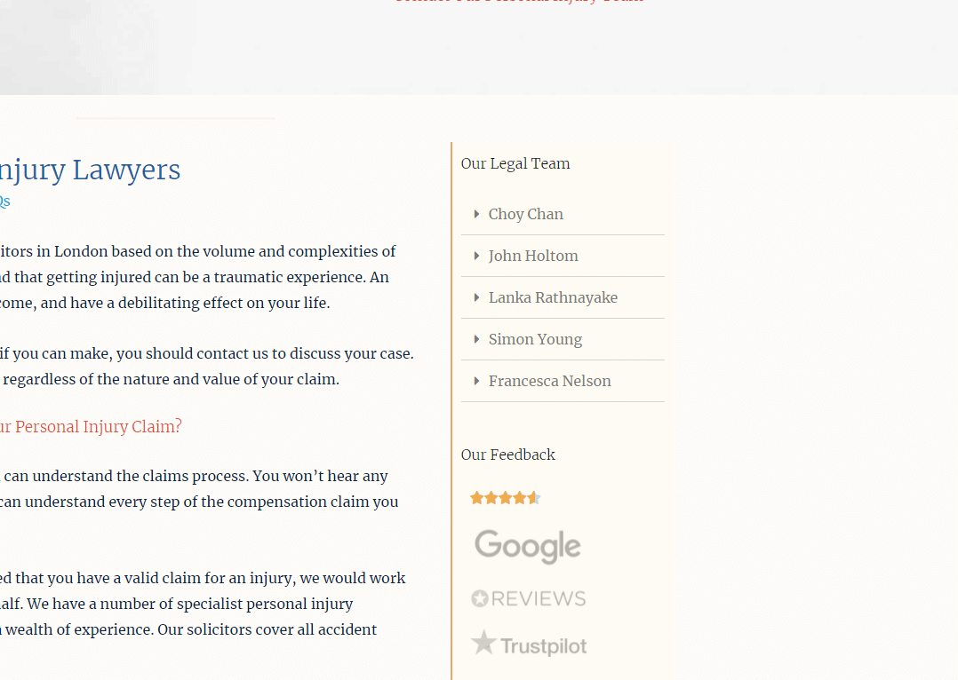
FreemanHarris is a great case of a lawyer company with an SEO-friendly website. Looking at the full SEO picture for their website, you can see that they aren’t some conglomerate with infinitely deep pockets. Surprisingly, however, the company ranks well for its relevant keywords such as “London personal injury lawyer.”
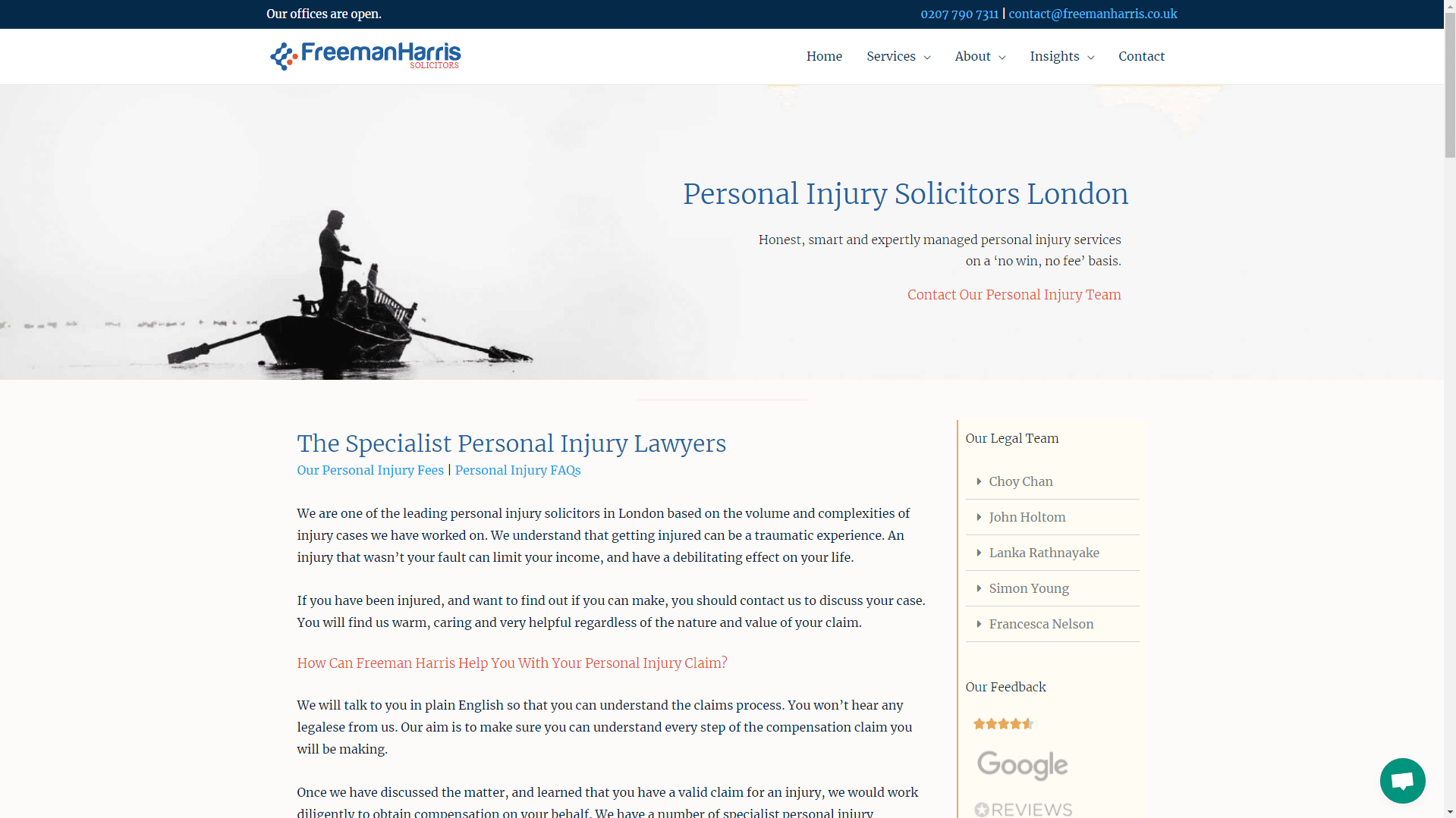
The answer to this becomes very apparent when taking a look at the structure of their website. Their website is fast, their layout communicates their brand effectively and is easy on the eyes. Their landing pages are built with the user in mind, as they contain tons of relevant information – from relevant copywriting, FAQs, a pricing table, and a contact field. Having this is important as it helps not only search engines rank the page but also keeps users longer on the site by providing better help.
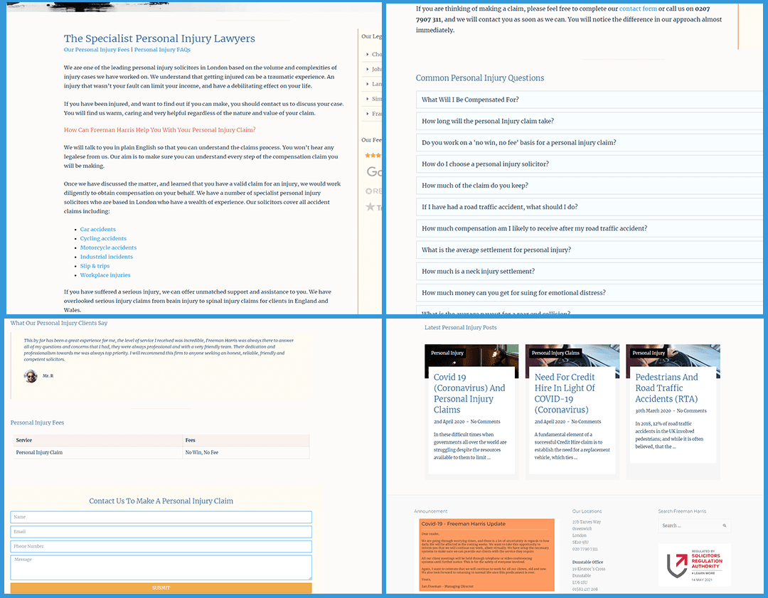
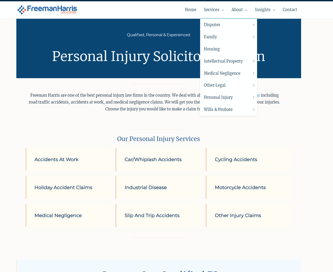
As noted in the tips above, they are also implementing content hubs. This helps them rank not only for more specific long-tail keywords (e.g., “divorce lawyer London,” but also for broader keywords that do not specify the direct intent (e.g., “family lawyer London”).
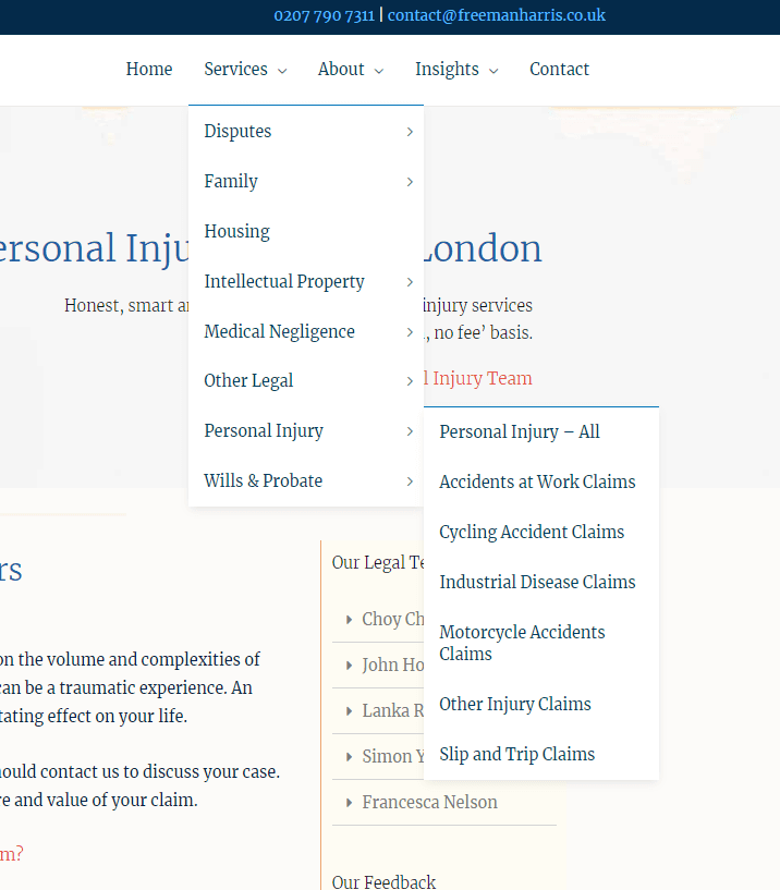
Looking at their navigational menu, you can see that they have approached their website design very strategically. Each of the services they want to be found on appears on its own dedicated page that is well-optimized. As such, Google sees their pages as very relevant and promotes them in search.
While I do not have the exact numbers, I’m also certain that their conversion rates are high as well. They have a very relevant Call-To-Action button at the top of the page that has contrast and stands out from the background. As you can see, they used the color palette in a very smart way so that each color represents a specific and recognizable element. For example, their most important CTA button is always red.
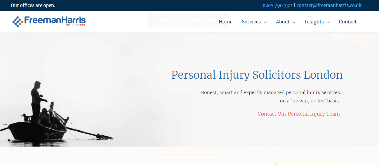
Similarly, something that improves both SEO and conversions is their approach to E-A-T. On every landing page, they have a unique table representing their team’s qualified lawyers for the job. This is additionally backed up by their social proof with links to their Google, Reviews, and Trustpilot ratings. Lastly, further down the page, you can also see that they feature testimonials from their customers.
Example 2: an SEO-friendly web design for an eCommerce store
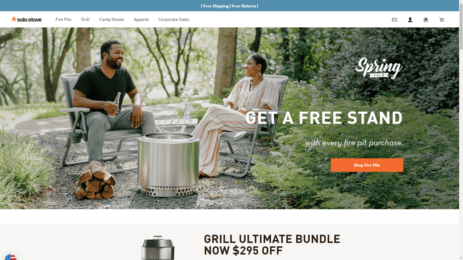
The website SoloStove.com is a perfect example of an SEO-friendly web design for an eCommerce store. They offer high-quality grills and grilling accessories at very reasonable prices.
Breaking down the layout of the page, we can take an educated guess that their best-selling products are fire pits – as they have highlighted that in the Hero section of their homepage. The website is also stunningly fast, while the images still look great.
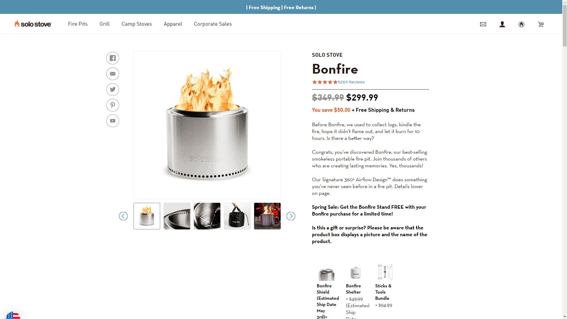
What’s unique here is their approach to SEO. For a keyword like “smokeless fire pit,” it’s standard for eCommerce companies to have a product category page ranking. However, because SoloStove has one signature product in that category, they have directly optimized their product page to rank for that keyword.
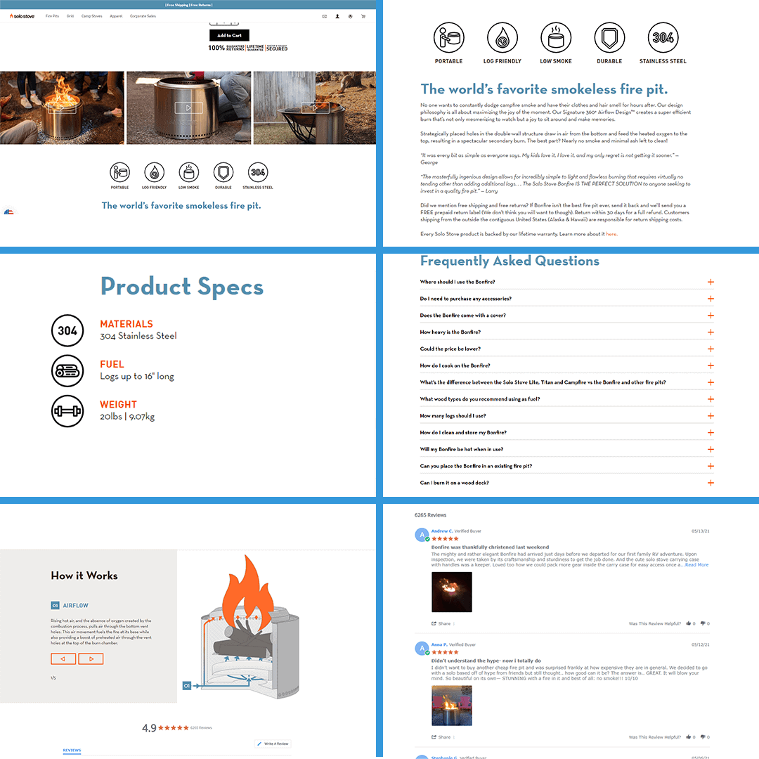
The great part about this is their execution – while they do offer a single product, they offer a ton of information on the product page, similar to what you’d expect from a whole category page. This amount of relevant content helps them both rank higher in search engines and convert more people to customers.
Example 3: an SEO-friendly web design for a SaaS company
For a well-optimized and SEO-friendly SaaS website, we need to look no further than the company DashThis.
From a technical perspective, they have a fast website with a straightforward page layout, which is expected, given that the software industry is highly competitive.
From a content perspective, they have a crazy number of relevant landing pages, which, based on my analysis, is a huge driver of traffic and sales. As you can see, they have found a perfect mix of keywords based on highly relevant purchase intent:
- They have landing pages based around their audiences (e.g., “/marketing-agency-reporting-software/”)
- A set of pages based around specific problems (e.g., “/ecommerce-reporting-tool/“)
- A bunch of pages around integrations with popular platforms (e.g., “/google-analytics-dashboard/”)
- Another set of landing pages offering templates for different purposes (e.g., “/advertising-campaign-report-template/”)
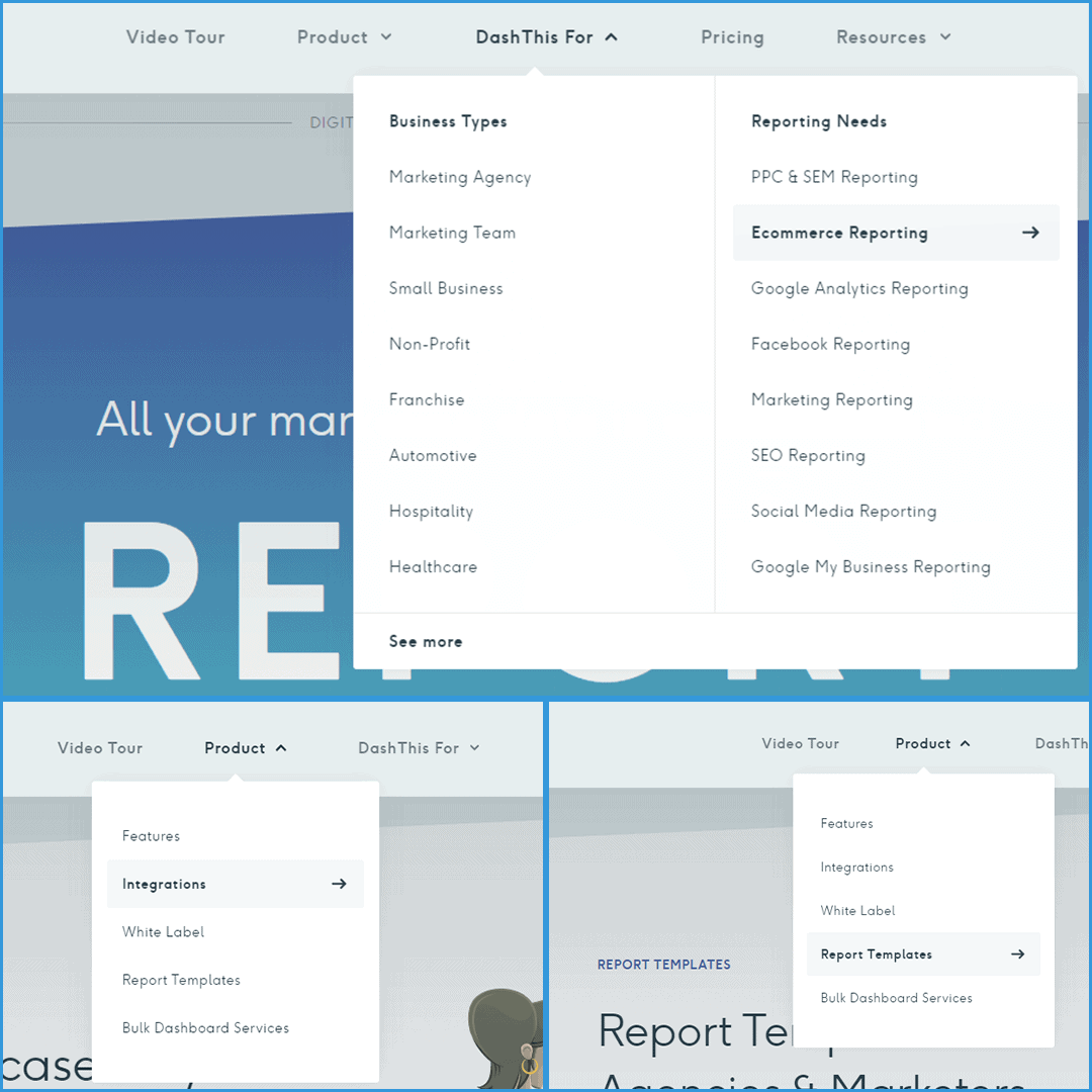
By analyzing the content, we can see that they implement a very strategic layout, as the pages are optimized for conversions. For example, all of their main Call-To-Action buttons maintain the same color scheme and anchor the user that this color is the “action” color.
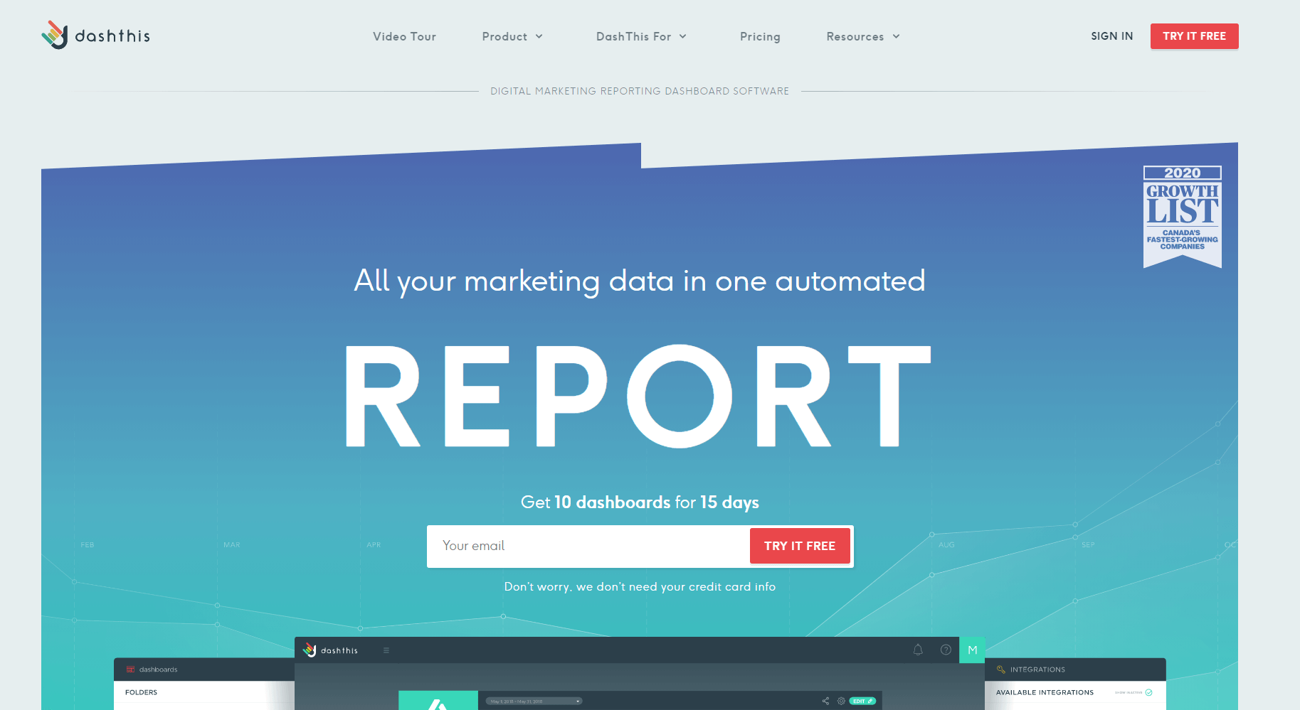
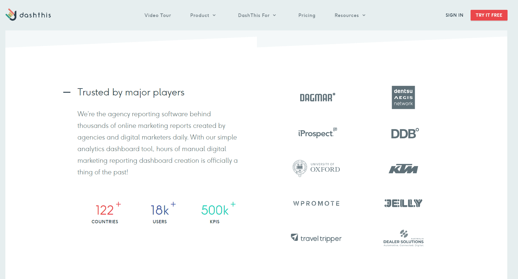
Similarly, they implement social proof as part of their page by listing not only customer logos but also relevant numbers and KPIs.
Example 4: an SEO-friendly web design for a blogger
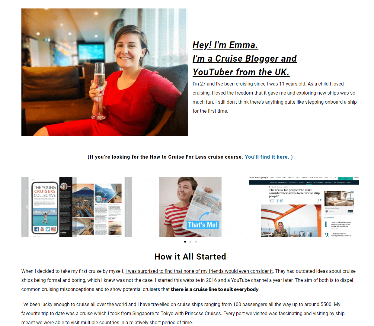
EmmaCruises.com is a blog focusing on cruises created by the award-winning blogger Emma Le Teace. It is the perfect example of a passion project done right in all aspects, including SEO.
Starting off, you can see that the layout of the page is very much structured around blogging. The main content on her landing pages is her articles, with additional information being provided on the sidebar. She uses a lightweight theme and fast web servers, so her website load time is low.
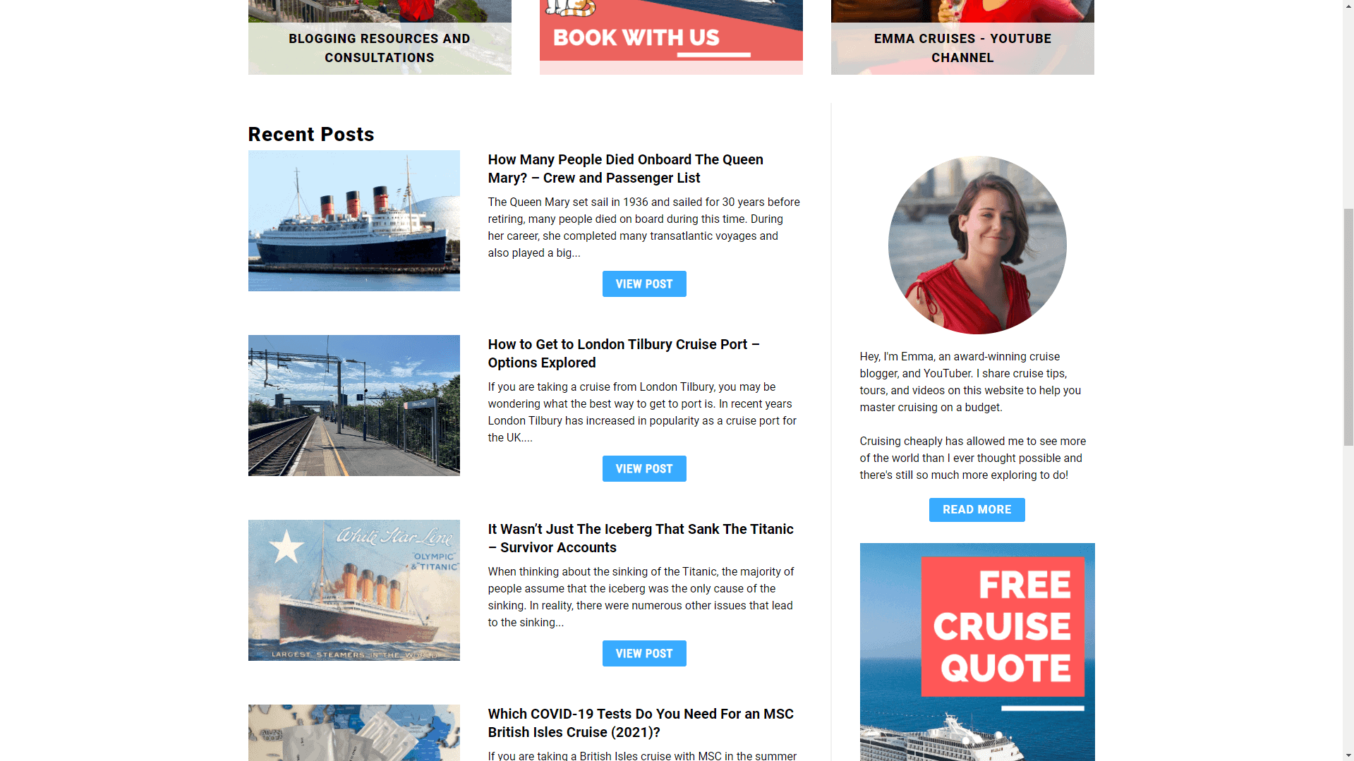
As Emma doesn’t operate a cruise fair, her monetization strategy revolves around informational SEO backed by her premium content, partnerships, and affiliate deals she has struck with other companies.
If you have some previous experience with blogging, you might have noticed that many bloggers start with the monetization idea of offering ads on their websites. What stands out in Emma’s case, however, is that there are no ads.
This only points us to thinking that she has been able to build an audience of followers that are looking exactly for the informational value she provides. This is great from an SEO-friendliness perspective because:
- Third-party ads introduce additional scripts that have to be loaded by the website visitor, thus slowing down the overall page load time. As we established, every (milli)second matters.
- Ads are often a big cause for layout shifts and intrusive user experience. Given Google’s latest Core Web Vitals changes, this can hurt the overall rankings.
- The purpose behind an ad is to get clicked. As an independent blogger who has to fight for and earn through hard work every website visitor, it is in your direct interest to keep users on your platform longer. Offering 3rd party ads from platforms like Google Adsense, in a way, goes against that idea, as the ads want to pull the customer towards another website.
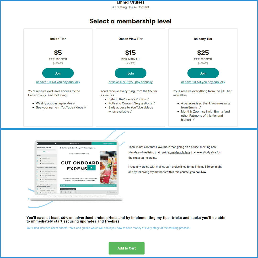
One other thing that becomes apparent is the E-A-T she has built. Her content is so well-researched, in-depth, and original that she has earned lots of credibility in her industry. This has earned her both media appearances and tons of highly relevant backlinks. Overall, what Emma has done is truly something we can all admire.
Creating an SEO-friendly website is a process
To conclude, we’d like to stress once again that well-optimized websites don’t happen by chance. Because of that, consider SEO as part of your strategy already in the planning stages. Doing this will save you a lot of time, effort, and money for potential changes down the road. We hope you found these tips for designing an SEO-friendly website useful, and the examples were useful.
To monitor your SEO you need an SEO tool. For that, we have made a list of 16 of the most simple SEO tools for beginners you might want to have a look at.

